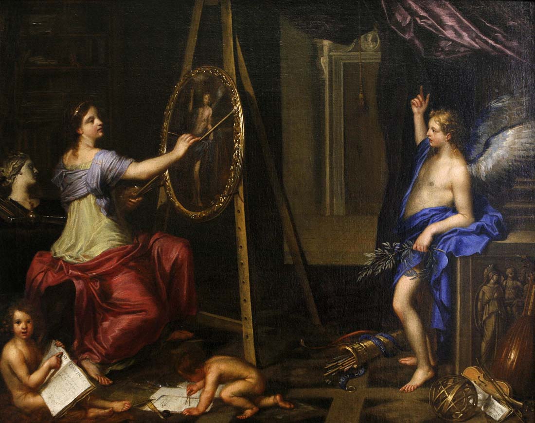
Charles Alphonse du Fresnoy, Allegory of Painting, Musée des Beaux-Arts, Dijon, 1650.
Du Fresnoy wrote about colors that appear on the palette of seventeenth-century artists, such as Rembrandt and Rubens, and that appear in Roger de Piles’ translation of De Arte Graphica:
“Red Oker is one of the most heavy Colours.
Yellow Oker is not so heavy, because ’tis clearer.
And the Masticot is very light, because it is a very clear yellow, and very near to white.
Ultramarine, or Azure, is very light and a very sweet Colour.
Vermillion is wholly opposite to Ultramarine.
Lake is a middle Colour betwixt Ultramarine and Vermillion, yet it is rather more sweet than harsh.
Brown-Red is one of the most earthy and most sensible Colours.
Pinck is in its Nature an indifferent Colour, (that is) very susceptible of the other Colours by the mixture: if you mix Brown-red with it, you will make it a very earthy Colour; but on the contrary, if you join it with White or Blue, you shall have one of the most faint and tender Colours.
Terre verte (or green Earth) is light, ’tis a mean betwixt Yellow Oker and Ultramarine.
Umbre is very sensible and earthy; nothing but pure Black can dispute with it.
Of all Blacks, that is the most earthy, which is most remote from Blue. According to the Principle which we have establish’d of White and Black, you will make every one of these Colours before nam’d more earthy and more heavy, the more Black you mingle with them; and they will be lighter, the more White you join with them.”
Some of Du Fresnoy’s descriptions of colors are not clear to the modern reader, such as the word ‘sensible.’
What does he mean by ‘heavy’? Perhaps he is talking about the relative opacity or covering the power of the color. He describes red ocker as one of the ‘heaviest’ colors on the palette and yellow oker as ‘not so heavy, because ’tis clearer’ and ultramarine and azure as ‘very light,’ which fits their relative opacity.
Although the color wheel was not to be developed until later in the century, it is interesting that vermilion is described as ‘wholly opposite’ of ultramarine, meaning that they are complimentary colors or a pair of “opposite” hues.
The text is made understandable through Roger de Piles’ commentaries on Du Fresnoy’s original treatise when we read, for example, remark 361:
“Let two contrary Extremities never touch each other, &c. The Sense of seeing has this in common with all the rest of the Senses, that it abhors the contrary Extremities. And in the same manner as our Hands, when they are very cold, feel a grievous Pain, when on the sudden we hold them near the Fire; so the Eyes which find an extreme White, next to an extreme Black, or a fair cool Azure next to a hot Vermillion, cannot behold these Extremities without Pain, though they are always attracted by the Glareing of two contraries.
“This Rule obliges us to know those Colours which have a Friendship with each other, and those which are incompatible; which we may easily discover in mixing together those Colours of which we would make and if by this Mixture, they make a gracious and sweet Colour, which is pleasing to the Sight, ’tis a Sign that there is an Union and a Sympathy betwixt them: but if on the contrary, that Colour which is produc’d by the mixture of the two, be harsh to the Sight, we are to conclude, that there is a Contrariety and Antipathy betwixt thefe two Colours. Green (for Example) is a pleasing Colour, which may come from a Blue and a Yellow mix’d together; and by consequence Blue and Yelloware two Colours which sympathize: and on the contrary, the Mixture of Blue with Vermillion produces a sharp, harsh, and unpleasant Colour; conclude then that Blue and Vermillion are of a contrary Nature. And the same may be said of other Colours, of which you may make the Experiment, and clear that Matter once for all. (see the Conclusion of the 332d Remark, where I have taken Occasion to speak of the Force and Quality of every Capital Colour.) Yet you may neglect this Precept, when your Piece consists but of one or two Figures, and when amongst a great Number you would make some one Figure more remarkable than the rest.”
This note is an interesting description of the visual appearance of complementary colors and the mixture of primary colors to produce secondary colors.
Reference
Charles-Alphonse Du Fresnoy, John Dryden, Richard Graham, Charles Jarvis, Roger de Piles, Alexander Pope. The Art of Painting. Translated by John Dryden. Contributors: Bernard Lintott, William Taylor, Isabelle Kittson Brown, Francis Bacon Library. Published by and printed for Bernard Lintott, 1716, p. 180.
The text is a translation of Dufresnoy’s De Arte Graphica written in Latin with additional text by other authors and translated by John Dryden.
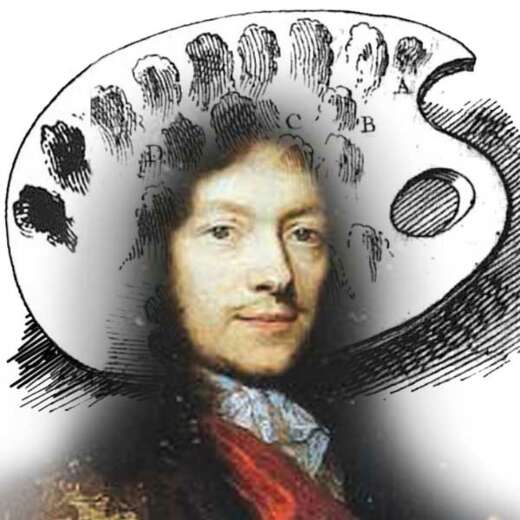
Charles-Alphonse Du Fresnoy, born in 1611 in Paris, and died in 1665, was a painter, an art critic, and a French poet. He was a student of Simon Vouet and a friend of Pierre Mignard, with whom he visited Italy.