The paints that I use from Natural Pigments are called Rublev Colours. Natural Pigments makes a boutique line of paints that are traditionally manufactured. By traditionally manufactured, I mean they are not made by a bunch of monks, but they are made with materials and recipes that are more traditional. Their main focus was originally to make paints out of traditional, non-manmade, non-synthetic pigments that you couldn’t find anymore on the market, and they bind them in simple binders without additives or stabilizers. What you find in these paints, because they don’t have stabilizers, because they don’t have additives, is just pigment and oil. You have a high pigment volume concentration. Each pigment acts a little bit differently because it’s ground to a different size and because each pigment requires a slightly different amount of oil or even a different type of oil. Some of these have bodied oils, and some have regular linseed oil, so you’ll find paint with a unique consistency, which is kind of cool. It’s definitely a lot of fun to play around with. Sometimes it’s challenging to play around with, but I’ll show you how I set up my palette with these colors.
Here are the colors that I’m using the most these days. I am more of a minimalist when it comes to my palette. I’m a big advocate of having a limited palette, especially when you’re a beginner. Over the years, I’ve added new colors to my palette. I’ve become addicted to a few of them, and now this is more or less the standard palette I’m putting out these days.
I’m gonna start by just laying out my palette for the day. Luckily, I will be painting later, so I’m not wasting all this paint. The first thing we need to do is put out my Lead White #2. Rublev Colours offer a few different lead whites, but this is the one I prefer. Making the transition from titanium white, I found this one the easiest one to use. It is the creamiest, but it’s still quite a bit different from titanium, and you’ll see that in a minute.
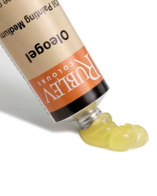
It is very thick and even sticky when it comes straight out of the tube. It actually has a spaghetti-like effect. It will create little peaks, that’s a strength, but I also find it rather difficult to push it around. I’m not a bravura painter. I don’t just leave big brush strokes everywhere. I like things to be delicately modeled and smooth, which interferes with me getting that effect. What I usually need to do to make it workable for me is to add a little bit of Oleogel. It can be linseed oil or Oleogel, but Oleogel is just so damned convenient to use, so that’s what I tend to use. You want to be careful when you do this to make sure you get the correct ratio, and the correct ratio is just whatever works for you. Too much Oleogel, and it gets to be too transparent and runny; too little, and it won’t do anything for you. I mix it in, and now you get an excellent creamy paint that moves and pushes around the way I want.
But there’s one more thing I can do to this paint, but I can use it this way, and I often do use it this way if I want to make the paint a bit beefier because it goes on relatively thin now. If I want to have a little bit more body, if I want to have some brush strokes and impasto, I will add a bit of Velázquez Medium. Velázquez Medium or Impasto Medium are similar, so either one of those will do, but I like the Velázquez Medium more and more these days. What Velázquez Medium is is a pigment, a colorless pigment; even though it appears white, it is a colorless paint. You’ll see that when you add it to other colors so that it doesn’t tint them because it is a colorless pigment plus a binder. That makes it paint, and since it is paint, you can add as much as you want to your paint without actually changing the nature of your paint. One of the problems of adding medium to your paint, of course, is that you weaken the paint film. The more oil you add to your paint, the more you weaken the paint film. You’re ruining that ideal ratio of pigment to binder. But because Velázquez Medium is technically a paint in the structure, you’re just mixing more paint into your paint, so you could add as much as you want if you want to.
Now I’ve got a paint that flows nicely. It’s really soft and buttery, but it has a bit more body and will stand up to the vigor of my brush strokes better. Now you might wonder why I didn’t just leave the paint in its original state because what I essentially did was I just made it runnier then thicker again. Still, the texture of this is entirely different than the texture of the lead white out of the tube, and I vastly prefer this one, so this is what I do. I like to use this when I’m painting flesh. I get a nice meaty paint application. I like it when I am painting white drapery, but apart from that, I don’t usually add Impasto Medium. I add Oleogel.
That’s been premixed. I’m going to put that right there. I like to keep my lead white near my thumb. The reason is that a lot of my flesh mixing happens right here, and to me, it’s comfortable working like this, and I wouldn’t say I like working like that. I see some people put the whites right at their elbows, and I see them the whole time painting like this.
The next color on my palette is Chrome Yellow Light. I used to use Chrome Yellow Primrose a lot, and then I discovered this one and decided this one just suited me a little bit better. It’s a very, very nice color similar to cadmium yellow. It’s interesting having this on my palette because it’s been years since I’ve had any cads on my palette or anything this dramatic. I was a very low-chroma painter until about a year ago, when I finally added chromatic colors to my palette. I used not to be very discriminating about my colors. I would try anything that worked, but then I went through this phase where I tried to discipline myself and work with low-chroma colors on a limited palette, which was really good for me. But now I’m going back, adding the dramatic colors, and it’s been a lot of fun.
This is Blue Ridge Yellow Ocher. It’s very similar to Winsor & Newton Yellow Ocher Pale or Mars Yellow by Old Holland. It’s just an essential color for my palette. I’ve always liked having this color on my palette; suitable for flesh. Just good for everything. Of all the yellow ochers Natural Pigments has, this is my favorite for the texture and tinting strength. Maybe that’s my bias because it’s similar to the other yellows I’ve used in the past, but that’s what I prefer. It has a nice texture straight out of the tube, so I don’t have to do anything to it.
This is Orange Ocher. This is one of my favorite colors. I can get a color very similar to it by mixing yellow ocher and burnt sienna or Hematite or whatever, but I love how it comes straight out of a tube, and it ends up being almost the perfect color for the red hair of some of my red-headed models. We are at the stage in this tube where there’s some oil separation happening. One thing that happens with these paints is oil separation because they don’t have stabilizers. What I do is I squeeze a bit of paint onto a paper towel and clean up this mess while I add it; otherwise, it just winds up on my hands at a later date. I just let it sit on the paper towel for a little bit and what you’ll see through the capillary diffusion on the paper towel is the oil gets wicked out of the blob of paint. After about a minute or so, you can take it off. Mix it up just a little bit to ensure it’s consistent throughout. And there’s the next color.
Setting up this palette is a little bit more maintenance than some palettes I’ve had in the past. This one is also separating quite a bit. I find that most of these paints have an oily spot, and then you get through it, and then towards the end of the tube of paint, you’ll have some dry paint. It’s not actually dry, but I mean that the oil ratio has dropped down, so it’s mostly pigment at that point. When that happens, you fix the situation by adding a bit of oil, and I think I have a tube of paint like that, so I can demonstrate that in a little bit.
The next color is Orange Molybdate, a high chroma orange-red. I don’t use it a ton, but when I need it, it does help me out, especially in dark shadow areas when I need to bump up the chroma without raising the value.
This is Hematite. It’s similar to French Burnt Sienna, which I used to use instead of this one. I still love French Burnt Sienna, but this is the tube I have out, so I use it these days. I might switch back. They’re so similar; the only differences are that French Burnt Sienna is much more transparent than Hematite, and Hematite is a bit rosier. The textures are slightly different; French Burnt Sienna is gritty and interesting. Hematite is gelatinous and blobby.
This is Madder Lake. I don’t know if they make Madder Lake anymore. (Editor: Yes, we reintroduced Madder Lake this past year.) This is a really old tube. I think they’ve replaced it with Alizarin Crimson now. It’s also a staple on my palette for flesh. I usually use it on the rosy parts of a person’s face, not throughout, just mostly on cheeks, lips, the intense reds, and someone’s eyes, and it usually ends up being mixed with Hematite.
This one is called Cyprus Burnt Umber Warm. I love this color. It’s just a fantastic color, but one thing about it is that I use it in the shadows a lot, especially in flesh passages; since I use it in dark areas and shadows often pure, I like it to go on thin. I like to keep my shadows a bit thinner, and this is just a bit too pasty and thick for me to drag it thinly into shadows easily. What I do is I do the Oleogel trick again. Again, you can use Oleogel or linseed oil; it doesn’t matter. I find it so easy to use Oleogel, and I mix a teeny bit of it in there, and it spreads the paint right out. Now it flows so much better. I can spread that thinly in shadow areas now.
I do the same thing with the next color, Cyprus Umber Dark. I would like that to have a much more flowing texture, but I’m not going to bother to demonstrate that again for you.
Next up is Ultramarine Blue (Red Shade). This is an essential color for me. I use it a ton. I like to keep it nestled between the umbers and the black because I use it to mix with my umbers. You get some interesting neutral tints when you mix this with the Cyprus Umber Dark or Cyprus Burnt Umber Warm.
Next up, I will not put it out today because I will not use it in my painting, but it is an exciting color. It is called Roman Black, which is noticeably lighter in value than other blacks when you put it on the palette. I will put it out so you can see that. What I like to use it for is flesh. For a while, I did not use black for flesh. The problem with using black for flesh is that it is too cool. It is too cool for school. It’s too cool to work with because it makes your flesh tones look a little too sickly, greenish, muddy, or whatever, but this black, Roman Black, is very neutral. I used to mix up a neutral tint for my flesh, taking black and burnt umber. But with this black, I can use it straight out of the tube, so I do not have to premix my black with a brown to warm it up. This is an excellent neutralizer for flesh tones, so anywhere the flesh gets less intense in color, less saturated, and more neutral, I get my students to use this to add to flesh. This is the simplest way to get a student to lower the chroma on flesh.
We are not using compliments. We are not being elaborate or complicated on how we are mixing colors. We’re just doing the simplest thing, which takes a neutral black and adds it to flesh, and usually, we have this premixed in tints with different values, and it’s an excellent simple way to control the chroma of your flesh. I’m not working on flesh today, so I’m just gonna take it off my palette. I hope you can see in this film that this is lighter in value than this Bone Black. It is just kind of interesting. It’s not altogether very different from, say, Mars Black. I think chemically; it’s the same thing. I’ll take that off.
Now the final color here is Bone Black. This is a lovely dark glossy black. I think I am at the point in the tube now where there’s a little less oil, and you can see; as a result, it’s a little bit more matte than I would like. I want my black to be as glossy as possible when I put it on my painting because I want to see how dark it is. If I were to paint, this is on my painting right now; it’s matte. I might trick myself about how dark it is. Then I would varnish my painting, and then it would get darker, so I want to ensure that the black is the actual value when I varnish the painting. If I have to, I will add a little Oleogel, just a teensy little bit. I’m just restoring the oil ratio that the paint should have because, as I said, the oil does separate in the tube, and you wind up with these patches of paint where there’s not as much oil. That’s already glossier and darker, and now I’ve got a more accurate picture of what that black will look like, so if I put that pure on my painting, I know exactly what it’s going to look like after it is varnished.
The problem with Bone Black, which is a problem with most blacks unless they’re an iron oxide black, is that they take forever to dry. Even when they seem to be dry, the paint film seems to be weak, and that is just not very helpful, especially since, as you know from my previous video, I like to take a solvent, which is the essential oil of petroleum, or Rublesol Lite, and I like to use that to saturate my paintings, take a look at them and if this color still isn’t dry. Usually, it’s the last to dry, and those areas might come off my painting. What I do to accelerate the drying of bone black is a couple of things you can do. One is to take an alkyd medium of some sort and add just a touch to accelerate the drying, or you can do something even more straightforward and take a little bit of your Cyprus Umber Dark, which is dark in value. If you look at that, we’re not going to alter the value too much and mix that in there. Umbers dry quickly because of their manganese content, so I’m adding some manganese dryer to my black, which will dry faster. So there you go.
So that’s how I set up my palette. It can be a little bit labor-intensive on some days, but usually, I’m not talking when I do it, so I usually get it done in about 10 minutes, and that’s how it’s typically set up when I’m painting. This is the order that I like to have my paints in. I like to go from my lightest colors to yellows to reds, browns, blues, and black. If there’s a green, it will go in here. I just kind of like that nice rainbow look.

If you’re interested in Rublev Colours Artist Oils or were thinking about buying my paint set, this video will acquaint you with how I prepare my palette. Many of the colors require some personalization before I use them. You’ll see it in the video.
Here’s the color list:
Lead White #2
Chrome Yellow Light
Blue Ridge Yellow Ocher
Orange Ocher
Orange Molybdate
Hematite
Alizarin Crimson
Cyprus Burnt Umber Warm
Cyprus Burnt Umber Dark
Ultramarine Blue
(Roman Black)
Bone Black
Buy the