An earth color palette, the core palette used by old masters, provides both important limitations and advantages. The most significant limitation is the number of hues available in very light and dark values at a high intensity (chromatic purity). A palette consisting of cadmium, azo and pthalo pigments does not present this limitation. On the other hand, a palette of these colors requires close control of the value and intensity of each color used in mixtures, and these colors can rarely be used pure. Earth colors, because of their subtle nature (which means they quickly lose intensity when mixed with white or darker colors) and the harmony of their hues and relative values, can be used more spontaneously. Although the limitation mentioned, a great variety of color effects is nonetheless possible; a variety considered more than adequate by many of the greatest old masters, including the most famous colorists of the Renaissance.
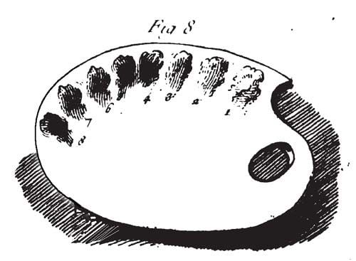
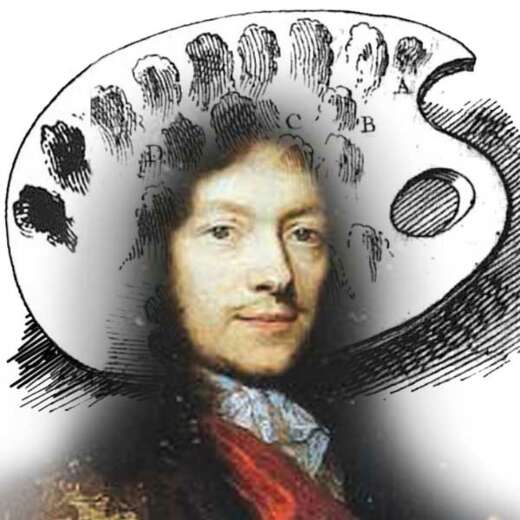
Roger de Piles’ flesh tone from his 17th-century book, Les Eleméns de la Peinture Pratique.
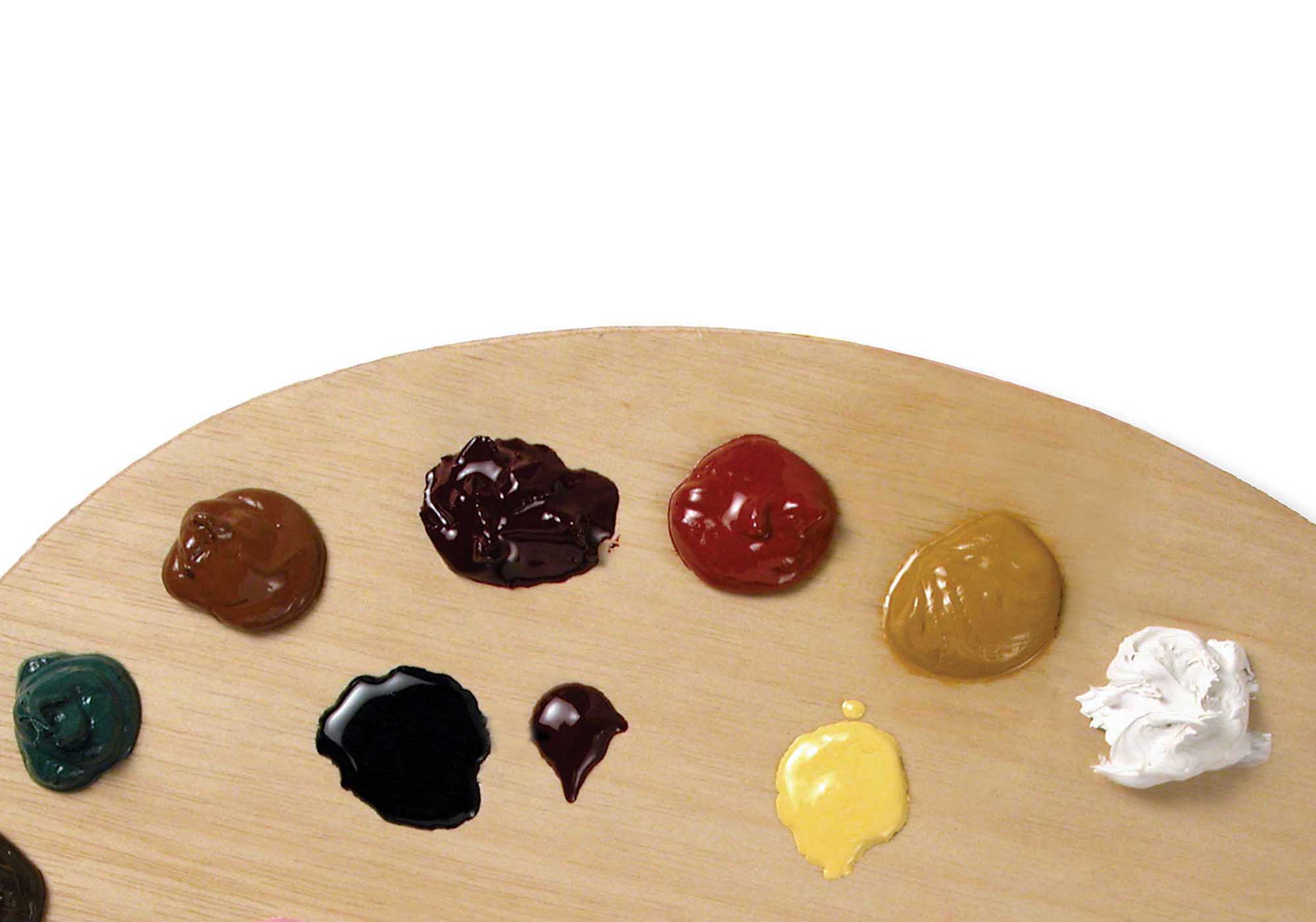
Set up your palette as you wish, or use a variation of the logical scheme often used by the old masters of the seventeenth century:
Place (1) lead white nearest the thumbhole and along the edge from white place (2) yellow ocher, (3) green earth, (4) sienna, (5) red ocher, (6) umber and (7) black. This arranges the colors in order of values (from light to dark) with green where it can be conveniently mixed with yellow. (The colors described in Roger de Piles’ palette are arranged in this way: 1. White lead. 2. Yellow ochre. 3. Brown red. 4. Lake. 5. Stil de grain. 6. Green earth. 7. Umber. 8. Bone or ivory black.)
Just as a palette of intense colors must be “mixed down” to create harmonious effects, earth colors must be used pure or nearly pure if the painting is to have a pleasing harmony of intensities. This means they must be fitted into the painting’s value scheme where the pure color falls. Thus the only light colors that can be both light and very intense are yellow and white. It is possible to have white tinted with green or red, but these mixtures would be “intense” in their whiteness, not as green or red. Red, particularly Ercolano red, can be quite light and intense as well, but not so light and intense as yellow. On the other hand, a great variety of pleasing middle-tone colors can be mixed, and this (generally speaking) is where most of the colors in a painting should be.
Roger de Piles described various color mixtures or tints for painting flesh tones based on the colors in the previous illustration.
Blue can be added to the palette (put it next to the green), but the wise beginner will use the old master trick of light grey for blue. In the context of the earth color palette—if the colors are not allowed to get muddy—a mixture of black with white (to derive a cool grey) will function as blue.
There is no law against adding other colors to this palette! But, as a rule of thumb, they should be used as “jewel colors.” Just a touch here or there can liven things up. The earth palette, however, does not inherently need livening up. Not only harmonious but also powerful and intense effects can easily be created. It is also possible to make a dull and muddy mess. What is impossible is a color effect that is acid, shrill, oppressive, or unbalanced. Such effects are inevitable if a palette of intense colors is not handled with practiced deftness.
To avoid muddy effects, use the set palette suggested above and mix colors only with their immediate neighbors or white. This is just a rule of thumb! All the colors can be mixed, even three or four at a time, to good advantage when one has a clear idea. A fundamental scheme is to paint darks with umber, mid tones with sienna, and lights with yellow. Of course, this must be modified depending on the color of what is being painted. But imitate the masters: do not think about color in terms of “local color.” Whatever color an object in your painting may be, think about interpreting that color, in the context of your painting, with the various colors on your palette. If something is color x, do not paint the light part with x and white and the dark part with x and black. As a guide, here is one approach: if the local color of an object is bright yellow, paint the light part pure yellow (perhaps with a decisive stroke of nearly pure white as a highlight) and the dark part with sienna; if it is bright red, paint the middle tones pure red, the light part with red and white, and the dark with umber and red; if it is bright green, lay in pure green earth where the value is correct, use green and white (mixed with yellow if it is a warm green) for the light, and perhaps umber for the darks with a dash of green as reflected light.
In painting, however, one must plunge in and see what is what. If you remain sensitive to the intensities—in particular, allowing the middle tones to sing with certain intensity—you may soon see how the earth palette will carry you along.
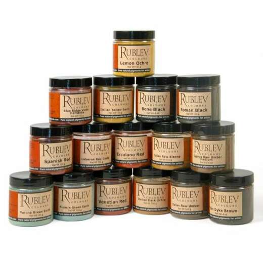
Where to Buy the Earth Color Palette
Shop now for the