
In the April 2006 issue of Watercolor Artist (formerly Watercolor Magic), Butch Krieger introduced Rublev Colours Watercolors for the first time to the magazine’s readers. The Rublev Colours Flesh Tint Palette is a triad of traditional earth pigments used by many 18th and 19th-century watercolorists to mix their flesh tones. The three components of the Flesh Tint Palette are Verona Green Earth, Italian Yellow Earth, and Red Sartorius Earth. Each of these three colors is a genuine pigment imported from Italy. In other words, these are the same pigments the past masters used in their watercolor paintings.
In the original article, the artist featured only light flesh tones, but Butch Krieger paints portraits of diversity. In this article, we have added two portraits by Butch featuring different skin tones using the base of three colors with an additional pigment.

The intention of Butch’s article, originally published in April 2006, was to help artists understand how to execute watercolor portraits. The inclusion of two portraits of non-caucasian subjects by the same artist recognizes the importance of including the skin colors of all humans. We’ve added these portraits to rectify a perspective we all should have regarding painting flesh tones.

Although the three colors described in the article can be used to create flesh tones other than caucasian, some may find it more practical to add raw umber or black iron oxide to the palette as a quicker means to arrive at darker skin tones. Using the same color chart, raw umber can be added to create warmer skin tones, while black iron oxide can be used to cool flesh tones.
And now to the original article...
The Verona Green Earth, unlike most of the green earth on the market, is not “enhanced” by the addition of synthetic pigments (usually viridian or chromium oxide green) but rather is a single pigment. This is significant because such augmentation can change the paint's working properties. Chromium oxide green, for example, is opaque and thus can compromise the transparency of an earth pigment. Rublev Colours Verona Green Earth is a deep, transparent pigment that lends itself well to making flesh tones.

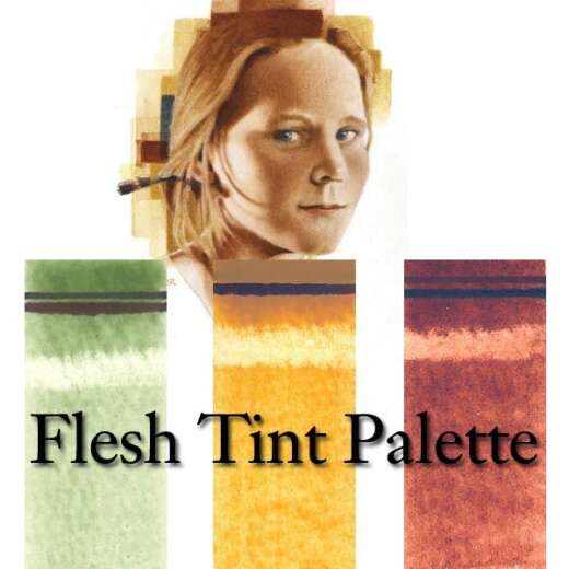
Rublev Colours Flesh Tint Palette of three watercolors consists of Verona Green Earth, Italian Yellow Earth, and Sartorius Red Earth.
The Italian Yellow Earth is a rich yellow ocher. Unlike most ochers, though, it is surprisingly straightforward and transparent. Its transparency, along with its golden hue, makes it an excellent pigment for making flesh tones. It is also helpful in painting blonde hair, as I did with my demonstration portrait.
The Sartorius Red Earth is a rich, orangish-red color. The Sartorius Red, although not quite as transparent as the other two pigments, is transparent enough to make beautiful vivid flesh tones. Like the Verona Green and Italian Yellow, Sartorius Red is a single pigment mined in Italy.
If you are new at mixing flesh tones, the simplicity of the Flesh Tint trio offers you a particular advantage. Not only do these pigments lend themselves to making flesh tones chromatically, but their inherent transparency enables you to avoid muddy mixtures. (Opaque pigments tend to get mucky when combined.) Thus, you can mix these three pigments to match the skin color you desire without getting the murky mud.
I have included two illustrations to introduce you to the Flesh Tint Palette in this article. One is a chart, which I made with three color palettes. And the other is a two-part illustration showing how I used it to do a test portrait. This should give you a good idea of how the Flesh Tint Palette works.

Finished portrait using the three watercolors of the Rublev Colours Flesh Tint Palette.
Demonstration Portrait
This mini-portrait shows you how I do a trial run with new flesh-tone mixtures. The purpose of my trial runs is to try out the new mixtures before I try to use them in a more formal portrait. In this case, I am using an image from one of my watercolor pads. (I usually pencil-sketch my subjects on the spot in my watercolor sketches and then color them later.) My “model” was a blonde man with a reddish beard with very masculine, chiseled facial features.
We have reproduced the finished painting in two sizes. The first is shown on your screen at approximately the same size as the original art, and when you click on that image, you can see a second image reproduced at about 200%. The result is an overall image four times as big as the original image. (Please note that the image size will vary depending on your monitor. To see the image at the correct size, the screen resolution must be 1024 by 768 pixels on a 17-inch monitor.)
I often do my color studies small because it is faster than doing a larger work of art. It takes less time to do a small painting than a big one. I have also found that if I do a portrait that is very much bigger, I tend to lapse into an entirely different mental mode. And when that happens, I start treating it like a more formal portrait and over-developing it. The enlarged image is here so you can more easily see what I have done in the color application.

Earlier stage of the portrait with only the base flesh tone.
You can also see an image of the painting at an earlier stage. At this point, I have used only the base flesh tone, which I mixed from the three component colors of the Flesh Tint Palette, to do most of the modeling—including the hair, shirt collar, and tie. Now that this chromatic foundation is established, I can bring in the modifying colors.
In the finished painting, I have brought in the supplemental colors. I have applied Vermilion to the pinkish parts of the model's face, with a little extra on the lower lip. I have also used the Vermilion to make the beard a little redder.
I used a touch of Malachite for the areas on the side of his face, neck, hair, and collar that are oblique to the primary overhead light source. In the front areas of his face, I have glazed some Lazurite to suggest a reflected blue light. I painted his tie with Crimean Hematite, a subtle violet hue. I have brought some hematite up to the bottom of the model's chin. I have also used it to darken the shadow areas of the blonde hair. And finally, I have glazed just a touch of Yellow Chrome over the top of the head to liven up the man's blonde hair, particularly in those areas that are getting a solid hit of the dominant light source.

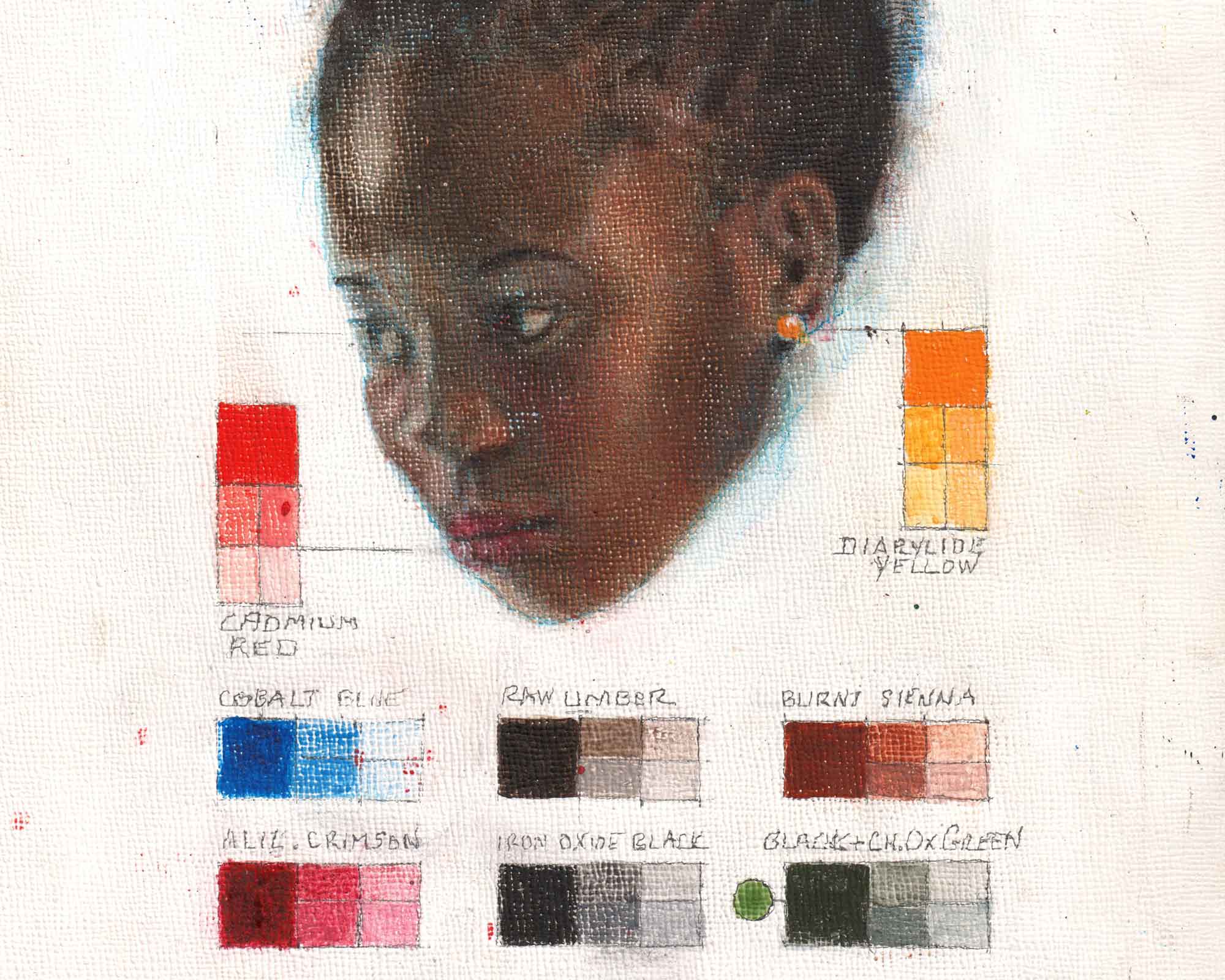
Color chart of a flesh tint continuum
Color Chart
I made this flesh-tone chart with the Flesh Tint Palette. This simple graph represents the results of my experiments with that chromatic trio. At the top, you can see the three essential colors of this specialized palette—the Verona Green Earth, Italian Yellow Earth, and Sartorius Red Earth.
Beneath these foundation colors, I have made four flesh-tone continuums. The first two relate to pale Caucasian complexions, and the other two relate to East Asian complexions. Each of these four continuums is a mixture of just the three Flesh Tint Palette colors.
This article focuses on the two Caucasian continuums. The first of the two is an unadjusted continuum, which, in other words, is a simple tonal value scale. That means the ratios of the three colors remained constant from one end of the scale to the other. The only thing that varies across the scale is the degree of lightness or darkness of the mixture.
When I apply this mixture diluted enough, as on the far left, it is an excellent blend for the palest tones of many “white” complexions. As the mixture darkens, however, it becomes less and less suitable as a flesh tone. And by the time it is at its darkest, it does not look like a flesh tone. Thus I must compensate for this shortcoming.
In the next band, I made the necessary adjustment. As the tone darkens, I progressively amend the mixture by changing its ratio of colors. In this case, I adjusted it by increasing the relative amount of green. In other words, the darker the mixture becomes, the more green it has. This now gives me an adjusted flesh tone continuum, with which I painted the demonstration portrait.
Where to Buy