
Rembrandt Harmenszoon van Rijn (15 July 1606 – 4 October 1669) was a Dutch painter and etcher. He is considered one of the greatest painters and printmakers in European art history and the most important in Dutch history.
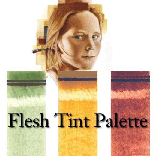
Rembrandt’s palette was not just a mere choice of colors; it was a deliberate, emotional, and intellectual selection aimed at bringing his subjects to life. Unlike his contemporaries, Rembrandt favored a muted palette, focusing on deep browns, rich ochres, and glowing umbers, contrasted with strategic highlights. This approach enabled him to create an astonishing range of tones and moods, all of which contributed to the dramatic intensity of his works.

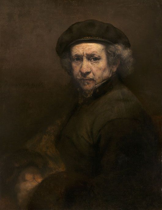
Self-Portrait, Rembrandt van Rijn, 1659, oil on canvas, 84.5 cm x 66 cm (33 1/4 in x 26 in), National Gallery of Art, Washington, DC, 1937.1.72
Historical Context and Influence
The 17th century, an era marked by significant scientific discoveries and a burgeoning art market, had a profound influence on Rembrandt’s color choices. His palette evolved over his lifetime, reflecting not only the artistic trends and material availability of his time but also his personal experiences and the maturation of his artistic vision.
The range of colors Rembrandt employed falls firmly within the mainstream of painting practice in Holland in the 17th century. His palette is entirely composed of widely available pigments, and by that time, well understood in their qualities and drawbacks. Seventeenth-century Holland was a hub for the industrial-scale production of artists’ pigments. The technologies required had evolved enough to remove the uncertainties in preparing standard products. Large-scale processes for producing lead white, vermilion, smalt, and lead-tin yellow, all of which are found frequently in Rembrandt’s paintings, had reached an advanced degree of refinement, and these pigments were available in both domestic and foreign markets. Imported pigments from Italy and elsewhere made up for local deficiencies in naturally occurring mineral and earth pigments and some of the raw materials for preparing specific manufactured colors.
Lead-tin yellow, in particular, played a pivotal role in Rembrandt’s palette. This opaque, cool, and lemony pigment was used to introduce luminous highlights that sliced through his generally warm, earth-toned compositions. Its distinctive brilliance gave life to illuminated areas—such as shimmering fabrics or the glint on a golden goblet—providing a striking counterpoint to the deep, muted hues Rembrandt favored elsewhere. Though toxic due to its lead content, lead-tin yellow was prized by Old Masters for its stability and coverage. By the 18th century, it began to disappear from artists’ palettes, gradually replaced by Naples yellow, and later by the advent of chrome yellow in the 19th century. The reasons for its decline remain somewhat mysterious, but its unique character is unmistakable in Rembrandt’s work, where it remains a signature of his handling of light and color.
Yet, despite the growing availability of pigments, the act of preparing paint in Rembrandt’s day was a laborious and essential part of the artistic process. Artists did not purchase ready-made paint in tubes; instead, they obtained pigments in dry powder form. Transforming these powders into usable paint required skill and patience—grinding pigment with oil on a flat stone using a muller, achieving just the right consistency and texture. For the most successful artists, this often meant employing assistants to handle the repetitive and physically demanding task of paint preparation. It wasn’t until the very end of the 17th century that the emergence of specialist “colourmen” began to change this—making paints commercially and selling them to artists in pig’s bladders, a precursor to the modern paint tube.
This interplay between traditional handcraft and emerging industry is reflected both in the character of Rembrandt’s palette and in the textures and effects he achieved on canvas. The careful selection of pigments, combined with the meticulous preparation of paint, underpinned the mastery and expressive power for which Rembrandt remains celebrated.
Is it Possible to Use Rembrandt’s Palette Today?
|
Analyzing the Composition of Rembrandt’s Pigments
To truly appreciate the Rembrandt color palette, one must delve into the specifics of its composition and how it was masterfully applied to canvas and panels. Researchers have found Rembrandt used the following pigments at different times in his work:
- Azurite
- Smalt
- Lead-tin yellow
- Orpiment and artificial orpiment
- Yellow ocher
- Red ocher
- Vermilion
- Madder lake
- Carmine lake
- Raw Sienna
- Burnt Sienna
- Raw umber
- Burnt umber
- Cassel earth
- Brown ocher
- Lead white
- Bone or ivory black
The Story Behind Vermilion
Vermilion, a strikingly intense red-orange pigment, has a fascinating and somewhat cautionary history. In Rembrandt’s day, this pigment was produced by grinding a synthetic compound called mercuric sulfide—a process originally inspired by the natural mineral cinnabar. While prized for its radiant hue, vermilion’s composition made it hazardous: the mercury content posed risks both to the artists who handled the powder and to those exposed to its dust or fumes.
Beyond its hazardous nature, vermilion had another drawback. Over time, areas painted with this pigment could darken or blacken after prolonged exposure to air or certain environmental conditions. Its toxicity and high cost to manufacture eventually led to its decline in popularity, particularly after the introduction of safer alternatives, such as cadmium red, in later centuries.
The Distinct Character of Genuine Smalt
Among the blues in Rembrandt’s palette, genuine smalt stands apart for its distinctive properties. Unlike the bold, high-tint synthetic blues we know today, smalt is a semi-transparent, subtly gritty pigment that brings a unique warmth and textural quality to the canvas. Its granulation offered Rembrandt both a softly luminous blue and a means to enhance physical depth within his paint layers—a trait not easily matched by modern pigments.
What sets smalt apart is both its hue and its texture. While modern cobalt and ultramarine blues can capture certain color notes, they lack smalt’s characteristic violet warmth and tangible, granular ‘body.’ Smalt’s slightly rough texture was not just a visual effect; it physically altered the surface of the paint, adding tactile richness and variation, especially in light passages and atmospheric backgrounds.
Over time, smalt’s vivid color proves to be fleeting. When mixed with oil binders—the norm for Rembrandt—the pigment slowly becomes pale and translucent, causing those blue passages to all but disappear from view. By the 19th century, as the chemical sciences advanced, artists sought pigments with greater permanence and reliability. Newly synthesized blues, such as cobalt blue and ultramarine, offered richer colors, superior stability, and predictability; as a result, smalt faded from everyday use, its visual qualities and technical quirks consigned to the past.
For present-day painters seeking to emulate smalt’s nuanced, slightly violet-leaning blue, several modern pigments present themselves as strong candidates:
- Cobalt Blue (PB28) and Ultramarine Violet (PV15): When mixed in roughly equal parts, these capture much of smalt’s subdued warmth and soft transparency.
- Cobalt Blue (PB28) alone: While cooler and less granular, cobalt blue nods to the historical precedent as a direct chemical descendant of smalt.
- Custom mixtures of ultramarine blue, dioxazine violet, and a touch of black can produce muted, textural variations reminiscent of the antique pigment.
What these modern colors lack, however, is smalt’s signature gritty, almost sandy texture—a characteristic Rembrandt would have put to expressive use in modeling surface effects. Artists intent on authenticity can approximate this by blending in a small amount of fine marble dust, lending a bit of that lost tactile quality to their blues.
Understanding the qualities and limitations of smalt—and how its optical effects can be simulated today—opens a window into not only Rembrandt’s materials but also his practical ingenuity and the ongoing evolution of the artist’s palette.
The Fate of Lead-Tin Yellow
Among the pigments in Rembrandt’s arsenal, lead-tin yellow stands out for its distinctive cool, lemony brilliance, which served as a striking counterpoint to the prevailing warmth of his palette. This pigment was a staple throughout the Dutch Golden Age, but by the eighteenth century, its use began to wane. The reasons for its disappearance from artists’ studios are not entirely certain—lead-tin yellow’s toxicity was known, yet many equally hazardous pigments continued to be used.
The gradual decline in the popularity of lead-tin yellow can be attributed to both shifting artistic preferences and the introduction of new pigments with similar properties. Naples yellow began to supplant it during the 1700s, as it offered a comparable hue yet was easier to manufacture consistently. By the early nineteenth century, the arrival of chrome yellow—brighter, more intense, and readily available—virtually eclipsed the older lead-based yellow. Although the original recipe for lead-tin yellow was rediscovered in the twentieth century, its high cost and continued safety concerns have kept it largely a pigment of historical use rather than a choice among most painters.
The Rediscovery and Availability of Lead-Tin Yellow
The original method for producing Lead-tin Yellow—a pigment beloved by the Old Masters—was indeed unearthed in the 20th century. However, due to its complex manufacturing process, high cost, and concerns about toxicity, it never regained its former popularity among artists. That said, traditional Lead-tin Yellow is not lost to history; Natural Pigments continues to offer the genuine pigment for those seeking to work with authentic historical materials.
Red Lakes: The Elusive Reds in Rembrandt’s Palette
Among the pigments Rembrandt favored the so-called “red lakes” held a special place for creating luminous glazes and rich depths of crimson. Unlike earth reds derived from ochres, red lakes were organic pigments extracted from natural dyestuffs—most commonly, carmine from cochineal insects or madder roots. These pigments produced vibrant, transparent reds ranging from warm rose to deep burgundy, depending on their method of preparation, which could be influenced by the mineral content or precipitation method.
In terms of technique, red lakes were often reserved for the most delicate passages in a painting. Their transparency allowed Rembrandt to glaze over more opaque reds, transforming basic underpaintings into sumptuous, shimmering surfaces—lines and fabrics pulsed with subtle, jewel-like tones. This versatility made red lakes indispensable for rendering the glow of flushed cheeks, velvet garments, and the rich drapery so typical in Rembrandt’s portraits.
However, these seductive hues came with limitations. Red lake pigments are notoriously fugitive, meaning their brilliance can fade over time, which is why today’s viewers may notice a more subdued red where once there was a vibrant color. Nevertheless, during Rembrandt’s era, their ability to add complexity and radiance made them vital for achieving the full expressive power of his celebrated style.
Availability and Qualities of Authentic Red Lake Pigments
Although most modern paints have replaced traditional Red Lake pigments with more lightfast alternatives, a handful of manufacturers continue to produce paints using the original, non-lightfast ingredients. These authentic Red Lakes, derived from natural sources, possess distinctive characteristics that distinguish them from their modern counterparts.
- Rose Madder, made from natural madder root, typically displays a restrained, earthy red reminiscent of dried blood—perfect for subtle, moody passages in a composition.
- In contrast, other formulations of genuine Rose Madder can appear much more luminous and lively, presenting a delicate, cheerful pink well-suited for vibrant highlights or floral details.
It’s essential to note that these traditional Red Lake pigments, although rich in history and unique in their visual qualities, are fugitive—they tend to fade with prolonged exposure to light. For this reason, artists often reserve them for works intended to avoid direct sunlight or for restorative projects where historical accuracy outweighs permanence.
Lightfast Alternatives to Traditional Red Lake Pigments
Artists seeking modern, reliable substitutes for the vibrant yet notoriously fugitive Red Lake pigments have excellent options with today’s improved chemistry. The best choices are single-pigment reds based on quinacridone or perylene formulations, which provide both the rich color and lasting durability that earlier organic lakes lacked.
For hues reminiscent of the brighter, pinker Red Lakes, look for paints made with PV19 (Quinacridone Red or Quinacridone Rose). These pigments combine exceptional lightfastness with that luminescent glow once reserved for more delicate historical colors.
If your palette demands the warmer, browner shades of traditional madder or rose madder, opt for PR206 (Quinacridone Burnt Scarlet/Brown) or PR179 (Perylene Maroon). Of the two, PR206 offers better transparency—ideal for glazing and building luminous depth, as Rembrandt himself favored with his layered techniques. PR179 yields deeper, more opaque maroons, providing flexibility for those who wish to experiment with strong shadows or subtle warm undertones.
While a few specialty paintmakers still offer genuine madder pigments for historical interest, these should be used with caution, as their color quickly fades when exposed to light. For most modern artists—especially those wishing to honor Rembrandt’s brilliance and longevity—quinoid and perylene reds present the best marriage of tradition and innovation.
Comparing Modern Quinacridone and Perylene Pigments to Historical Red Lakes
While Rembrandt reached for natural Red Lake pigments—such as Madder Lake and Carmine Lake—painters today look to modern alternatives like Quinacridone and Perylene when seeking those radiant reds and pinks. Let’s explore how these contemporary pigments compare to their historical counterparts in terms of transparency, color, and lightfastness.
Transparency
Red Lake pigments were renowned in Rembrandt’s era for their exceptional transparency, making them perfect for glazing. This translucency added depth and richness when layered over more opaque reds and ochers. Quinacridone and Perylene, introduced much later, excel in this same respect—their ability to create luminous glazes is comparable to and often surpasses the subtlety once achieved with traditional Red Lakes.
Color and Chromatic Range
The historical Red Lakes could range from soft pink to deep crimson, their exact shade shifting with the source material and preparation process. Quinacridone pigments, notably PR206 and similar hues, rival these classic colors in vibrancy and saturation. In fact, the intensity of certain Quinacridone and Perylene reds may come as a surprise, providing hues as rich or richer than genuine Carmine or Rose Madder—sometimes even echoing that famous, saturated warmth one expects from Old Master palettes.
Lightfastness
Where modern pigments truly outshine their predecessors is in permanence. Historical Red Lakes, particularly Madder Lake and Carmine, are notoriously fugitive—they fade or shift with time and light exposure, especially when thinly glazed. Quinacridone and Perylene pigments, on the other hand, are prized for their exceptional lightfastness, offering much greater stability and resistance to fading. While Alizarin Crimson (a 19th-century synthetic relative of Red Lake) improved upon the durability of natural lakes, it still can’t match the lightfastness of the newest Quinacridone and Perylene reds, especially in delicate glazes.
In Practice
For artists seeking to recapture Rembrandt’s glowing reds without the headache of fading, experimenting with modern Quinacridone and Perylene paints is highly rewarding. Their transparency and chroma evoke the spirit of Red Lake glazes, while their lightfastness ensures the colors stand the test of time.
The Core Colors of Rembrandt’s Palette
Rembrandt’s primary colors included earth tones like burnt sienna, raw umber, and yellow ochre. He complemented these with bold accents of vermilion, lead-tin yellow, smalt, and azurite, creating a harmonious yet dynamic color scheme. Each color served a purpose, either to model forms, define space, or evoke emotions.
The Role and Nature of Smalt
Among the more intriguing pigments in Rembrandt’s arsenal was smalt—a semi-transparent, gritty, warm blue pigment made by grinding potassium glass colored with cobalt. During Rembrandt’s time, smalt was a much more affordable alternative to the luxurious lapis lazuli. While we rarely think of blue as central to Rembrandt’s palette, this is partly because smalt tends to become brown and translucent with age, especially when mixed with oil binders. As a result, the original nuances and subtle blue undertones in Rembrandt’s work have faded, leaving behind mixtures that now appear far more subdued than when first painted.
Smalt’s unique granular texture contributed more than just color; it added body and a tactile quality to the paint layers, setting it apart from the smoother, more intense modern blue pigments like phthalo blue or ultramarine. Cobalt blue, a chemical descendant of smalt, tends to be cooler and more greenish, lacking the same warmth and violet undertones that genuine smalt provided. Smalt’s fast-drying properties made it a practical choice for underpainting and glazing, and its interaction with yellows, earths, and blacks created subtle shifts in hue and tone.
Although smalt eventually fell out of favor in the 19th century—replaced by more permanent and vibrant blues—today’s artists and conservators recognize its historical significance and unique aesthetic contributions. Some modern paintmakers offer smalt “hues” crafted from mixtures of cobalt blue and ultramarine violet or even combine marble dust to mimic the distinctive granular texture of the original pigment.
Techniques and Application
Rembrandt’s genius was not just in his color choice but also in how he applied them. His technique was a study in patience and precision, often building up color through layers of paint, each adding depth and richness to the image.
Layering and Glazing
Through layering and glazing, Rembrandt achieved an unparalleled depth in his paintings. The layers of transparent glazes allowed the colors to interact in a subtle and complex manner, creating a luminous effect that seemed to bring the paintings to life.
Transparency Differences: PR 206 vs PR 179
When considering pigments for glazing—especially those luscious, earthy browns popular in Rembrandt-inspired palettes—transparency is key. PR 206, often found in quinacridone-based formulations, is notably more transparent than PR 179. This characteristic makes PR 206 particularly well-suited for glazing techniques, allowing underlying layers to shine through and contributing to that glowing quality admired in Old Master works.
PR 179, while capable of producing rich, deep browns, tends to be less transparent. Its higher opacity can obscure previous paint layers, making it less ideal for situations where you want to build subtle veils of color or let light pass through multiple strata of paint. Artists seeking soft transitions and that signature sense of depth will often favor PR 206 for its versatility in glazing. In contrast, PR 179 can excel in applications where robust coverage or body color is desired.
The Role of Light and Shadow
Rembrandt’s understanding of light and shadow was revolutionary. He used his color palette to sculpt light, allowing it to cascade softly across a subject or to punctuate a scene dramatically. The interplay of light and dark, known as chiaroscuro, is a signature aspect of his work, showcasing his mastery of using color to shape space and mood.

Isaac and Rebecca, known as ‘The Jewish Bride’, Rembrandt van Rijn, c. 1665–c. 1669, oil on canvas, 121.5 cm × 166.5 cm (47.8 in × 65.5 in), Rijksmuseum
The Psychological Impact
Rembrandt’s colors do more than please the eye; they speak to the soul. Each hue, each stroke of the brush, carries an emotional weight, connecting with viewers on a deeply psychological level.
Emotional Resonance
The muted earth tones and strategic use of light in Rembrandt’s paintings evoke a sense of intimacy and introspection. His use of color is not merely for representation but to stir emotions and reflect the inner turmoil or tranquility of his subjects.
Symbolism and Meaning
In Rembrandt’s work, colors are not arbitrary; they are laden with symbolism and meaning. From the divine radiance of golden hues to the somber depth of dark browns, each color choice is a deliberate expression of narrative and thematic elements.
Rembrandt’s color palette is not just a component of his art; it’s a testament to his legacy as a master storyteller and visionary artist. His profound understanding of color’s power to evoke emotion, define space, and convey meaning continues to inspire and influence art and design. As we delve into the depth of his palette, we find more than just color; we find a reflection of life itself, complex, nuanced, and profoundly moving.
While Rembrandt’s palette feels timeless, it’s important to remember that his choices were shaped by the realities of his era. The pigments available to him—earthy ochres, deep umbers, luminous lead whites, and sooty bone blacks—were dictated by the resources and technology of the 17th century. Unlike today’s artists, who can select from a dazzling array of synthetic hues, Rembrandt and his contemporaries worked within the limited spectrum of their world. This constraint, however, became an advantage: by embracing the subtlety and harmony of these natural pigments, he was able to construct paintings of remarkable depth and emotional resonance.
Understanding Rembrandt’s color selections provides us with a rare glimpse into how the Old Masters constructed their visual narratives. Examining the hues of the past not only connects us to the world they inhabited but also invites us to learn from their resourcefulness and ingenuity. In studying Rembrandt’s palette, we discover lessons that transcend time—lessons in creativity, restraint, and the profound impact of color on the human spirit.
Shifting Hues Over Time
While Rembrandt’s signature palette already leaned heavily into rich earth tones and muted browns, the passage of centuries has subtly altered the appearance of his masterpieces. Many of the vibrant blues and reds he once employed have diminished, their intensity softened as certain pigments naturally faded with age. Compounding this change, the varnish layers applied to protect the surface have, over time, developed a yellowish cast. This yellowing acts like an antique lens, warming and dulling the original colors and deepening Rembrandt’s already autumnal palette.
The combined effect means the works we admire today tend to appear even more suffused with golden-brown harmony than when first painted—less brilliant in blue and red accents and more enveloped by the gentle gravity of ochre, sienna, and umber. Yet, in this evolution, the emotional resonance and psychological depth of Rembrandt’s color remain as compelling as ever.
Historical and Modern Substitute Colors
Rembrandt’s paintings are characterized by a limited palette of lead white, bone black, and natural earth pigments, such as ochers, siennas, and umbers; other pigments are occasionally used, but these are his staples. His palette consisted of the following pigments:
|
Pigment |
Oil Paint Equivalent |
Pigment Equivalent |
|
Azurite |
Not available |
|
|
Smalt |
Not available |
|
|
Lead-tin yellow |
|
|
|
Orpiment and artificial orpiment |
(orpiment) |
|
|
Yellow ocher |
|
|
|
Red ocher |
|
|
|
Vermilion |
|
|
|
Madder lake |
|
|
|
Carmine lake |
Not available |
|
|
Raw Sienna |
|
|
|
Burnt Sienna |
|
|
|
Raw umber |
|
|
|
Burnt umber |
|
|
|
Cassel earth |
|
|
|
Brown ocher |
|
|
|
Lead white |
|
|
|
Bone black |
|
|
In the table, we have listed the pigment used by Rembrandt on his palette and the equivalent available today from Natural Pigments.
Stil de Grain: Origins, Methods, and Obsolescence
Among the more curious pigments on Rembrandt’s list is Stil de Grain, a color whose hues ranged from yellow to brownish-green, depending on the maturity of the buckthorn berries harvested for its creation. The process behind this pigment was intricate: the berries yielded a soluble dye, which was then “laked”—that is, turned into an insoluble powder by combining it with a metallic salt. This conversion enabled artists to mix the pigment into oil paint, achieving subtle, transparent glazes.
Artists valued Stil de Grain for its unique transparency and the complex, soft tones it could introduce to a composition. However, they were well aware of its limitations. The pigment’s greatest flaw was its poor resistance to light; over time, colors faded, with vibrant glazes losing much of their original brilliance. Although still used throughout Europe until the 1800s, Stil de Grain eventually fell out of favor as more stable and durable yellows became widely accessible. Modern paints no longer employ it, favoring pigments that promise greater permanence and resilience on the canvas.
Today, artists seeking to capture the unmistakable transparent warmth of Stil de Grain have several excellent, more durable alternatives at their disposal, all recognized for their improved permanence and versatility.
1. Synthetic Iron Oxides (PY 42): Modern earth yellows, such as synthetic yellow iron oxide (PY 42), are frequently used to replicate the brown-yellow masstone and bright, transparent yellow undertones of historical Stil de Grain. These pigments not only offer excellent lightfastness but can also be formulated for transparency, making them particularly apt for glazing—much like their predecessor.
2. Green Gold (PY 129): To emulate the greenish variants of Stil de Grain, pigment PY 129—often marketed as Green Gold—serves as a compelling substitute. PY 129 is valued for its earthy green masstone that dilutes to a luminous yellow-olive, echoing the nuanced shifts Rembrandt might layer into a complex passage of color. When mixed with natural earths, reds, and blacks, this pigment brings the earthy warmth so characteristic of Rembrandt’s palette.
3. Transparent Oxides and Specialty Hues: Contemporary lines also offer other hues based on transparent oxides and synthetic mixtures that fall within the historic color’s spectrum, from brownish-yellow to olive or greenish tones. These modern formulations maintain the essential lively translucency artists once prized in Stil de Grain but with the added benefit of exceptional longevity and color reliability.
Summary Table of Modern Stand-Ins:
- PY 42 (Synthetic Yellow Iron Oxide): Offers transparency and warmth; a robust, glaze-friendly pigment.
- PY 129 (Green Gold): Replicates green-olive tones; versatile in mixtures for earthy, Rembrandt-inspired effects.
- Other Transparent Earths: Blend well with ochres, siennas, and umbers for subtle historic nuance.
With these modern pigments, artists can confidently recreate the effects of Stil de Grain—layering, glazing, and mixing rich earths—without sacrificing the integrity of their work to fading. Thus, while the original pigment’s days are past, its evocative hues live on in the hands of today’s painters through thoughtful material innovation.
Nickel Titanate Yellow: Modern Options and Mixing Insights
While Rembrandt himself could not have imagined Nickel Titanate Yellow gracing his palette, today’s artists have access to oil, acrylic, and watercolor versions of this subtle, granulating pigment. Nickel Titanate Yellow offers a pale, greenish lemon undertone that can be invaluable for mixing luminous greens, soft skin tones, or gentle highlights. In many professional paint ranges—such as those from Winsor & Newton, Schmincke, and Holbein—you’ll find Nickel Titanate Yellow available across various mediums.
This pigment is prized for its low tinting strength and slightly opaque quality, making it a favorite for nuanced glazing and for cooling down warmer yellows without overpowering them. When blended with blues, it yields muted, naturalistic greens—perfect for landscape passages and botanical studies. Added to earth reds or ochres, it lends an organic, sunlit feel, evocative of Rembrandt’s nuanced mastery of atmospheric effects.
Whether you’re seeking to replicate traditional effects or introduce delicate modern transitions, Nickel Titanate Yellow bridges the gap between Old Master sensibilities and contemporary versatility.
Modern Substitute for Vermilion
Vermilion, a deep orangey-red pigment, was a staple in Rembrandt’s palette and that of his contemporaries. The original pigment—genuine vermilion—is a synthetic form of cinnabar, a mineral containing mercuric sulfide. While celebrated for its rich, earthy glow and powerful opacity, genuine vermilion is also toxic due to its mercury content and can darken over time when exposed to air.
As a result, the use of genuine vermilion has declined since the 19th century, replaced by safer and more stable alternatives. Today, Cadmium Red Light is the most common substitute, offering a brilliantly clear and strong orange-red, though it is somewhat brighter and less muted than historical vermilion. Mixing it with earth pigments can temper its intensity, bringing it closer to the muted, sophisticated tones favored by Old Masters. Cadmium Red Deep, another alternative, shares some of the dullness of vermilion but leans more toward a bluish-red.
For those seeking the authentic hue, genuine Chinese vermilion oil paint is still produced by select manufacturers; however, most artists opt for cadmium-based reds due to their safety and reliability. These modern alternatives retain much of the original’s covering power and presence on the canvas, echoing Rembrandt’s intent even if their chemistry differs.
Replicating Browner Varieties of Red Lake
When seeking to capture the nuanced, earthy tones of the browner varieties of Red Lake, it’s essential to consider pigments that balance warmth, complexity, and transparency—qualities beloved by both Old Masters and modern painters.
Two pigments stand out for achieving these subtle browns:
-
Quinacridone Burnt Scarlet (PR 206): This pigment excels in glazing due to its transparency and rich, reddish-brown undertones. It brings depth and a gentle warmth to layers, making it ideal for evoking the soft, earthy shadows found in Rembrandt’s original palette.
-
Perylene Maroon (PR 179): Slightly deeper and less transparent than PR 206, this pigment delivers saturated, moody browns with a hint of red. It’s well suited for passages where greater opacity and intensity are desired, such as outlining forms or reinforcing dark accents.
Artists working in oil, acrylic, or watercolor will find these pigments particularly effective for recreating the muted, introspective character of historical Red Lakes, with PR 206 offering superior transparency for layered techniques. By carefully layering or blending these pigments—alone or with natural earths—one can achieve the rich, multifaceted hues that defined Rembrandt’s browner reds.
Substituting Red Lake’s Brighter, Pinker Hues
For artists seeking to replicate the luminous, rose-like qualities of Red Lake—especially its brighter, pinker variants—a reliable modern option is pigments based on Quinacridone Red (PV19). These single-pigment formulations closely echo the vibrancy and transparency of traditional Red Lake while offering greater stability and lightfastness.
Look for paints labeled with PV19 across watercolor, acrylic, or oil lines:
- Single-pigment Quinacridone Red (PV19) in any medium
- Transparent, lightfast reds such as Quinacridone Rose or Permanent Rose blends using PV19
- Select offerings from reputable brands like Golden, Winsor & Newton, and Langridge, ensuring they are labeled as PV19
By choosing these modern pigments, artists can achieve the rich, pink inflections characteristic of historical Red Lakes, but with the assurance that their work will stand the test of time.
Non-Toxic Alternative to Lead-Tin Yellow
If you’re searching for a non-toxic pigment that closely matches the distinctive cool opacity of historical Lead-Tin Yellow, Nickel Titanate Yellow (PY 53) stands out as the best substitute. Introduced in the 1960s, this pigment offers a similar pale, slightly greenish-yellow character and reliable covering power. Today, Nickel Titanate Yellow is widely available in oil, acrylic, and watercolor ranges, making it a practical option for artists seeking to evoke the subtle luminosity and body of Rembrandt’s original mixtures while using materials that meet contemporary standards.
References
David Bomford, Art in the Making: Rembrandt, Yale University Press, p. 35–46.
Waldemar Januszczak, Techniques of the World’s Great Painters, Chartwell, 1980.
Ernst Van De Wetering, Rembrandt: The Painter At Work, Amsterdam University Press, 1997, p. 149–152.
van Loon, A., Noble, P., Krekeler, A. et al. Artificial orpiment, a new pigment in Rembrandt’s palette. Heritage Science 5, 26 (2017). https://doi.org/10.1186/s40494-017-0138-1
Frequently Asked Questions
What are the key characteristics of Rembrandt's color palette?
Rembrandt's palette is known for its muted earth tones, strategic use of light and shadow, and deep, rich colors contrasted with carefully placed highlights.
How did Rembrandt achieve depth and texture in his paintings?
Rembrandt achieved depth and texture through meticulous layering and glazing techniques, allowing colors to interact in complex ways and creating a luminous effect.
How does Rembrandt's use of color impact the viewer psychologically?
Rembrandt's color choices evoke emotions and introspection, with each hue and stroke of the brush carrying an emotional weight that connects deeply with the viewer.
In what ways is Rembrandt's color palette relevant in modern art and design?
Rembrandt's palette influences modern art and design by inspiring artists and designers to use color to convey depth, emotion, and narrative, as well as to create ambiance and invoke emotional responses.
What can contemporary artists and designers learn from Rembrandt's approach to color?
Contemporary artists and designers can learn the importance of using color deliberately to evoke emotion, define space, and convey meaning, as well as the value of understanding the psychological impact of color choices.
Why did Rembrandt use dark colors?
Rembrandt used dark colors to create depth and focus on lighting and shadow, emphasizing the emotional and narrative aspects of his subjects. This technique, known as chiaroscuro, is a hallmark of his style, allowing him to direct viewers' attention and evoke a strong atmospheric or dramatic effect.
Did Rembrandt use a palette knife?
There is no direct evidence to suggest Rembrandt used a palette knife. His works are known for their intricate brushwork and texture, often achieved through traditional brushes. However, artists of his time were innovative and may have used various tools for different effects.
What was Rembrandt's favorite color?
While there is no definitive record of Rembrandt's favorite color, his paintings often feature rich, earthy tones like deep browns, umbers, and siennas, complemented by luminous highlights in yellow and white, suggesting a preference for warm, naturalistic colors.
Did Rembrandt use glazes?
Yes, Rembrandt was known to use glazes. He skillfully applied thin, transparent layers of paint over dry underpainting, a technique that allowed him to achieve rich, luminous colors and a remarkable depth in his work, adding to the three-dimensional effect of his paintings.
How many colors did Rembrandt use?
Rembrandt was not limited to a specific number of colors but rather had a palette consisting of a variety of natural earth tones, lead whites, and occasional bright colors. He was known for mixing and layering these colors to create a wide spectrum of hues and tones in his artwork.


