Sankir is “the initial underpaint tone, which cover the faces and other parts of the body; leaving the sankir exposed to create the shadow areas.” (Narodovskiy, 1914)
In the Hermeneia or Painter’s Manual, written by a monk and icon painter, Dionysius of Fourna, there appears the chapter, “On making underpaint for wall-paintings.” In this chapter, Dionysius elaborates on the making of sankir, “Take __ drams of terraverte, __ drams of dark ochre, __ drams of lime-white for working on walls, and __ drams of black; grind them up well and use as proplasmos (1) when you paint flesh colour.” (Restle, 1967)
In D. Ravinskiy’s book (Ravinskiy, 1903), sankir is described as follows: (2) “They ground themselves, first of all, sankir. Sankir is a dark color, consisting of ochre, chern (чернь) (3), green earth and cherleni (черлень) (4). The proportion of these colors in sankir varies according to the school; in old Novgorod and in early Stroganov icon painting, sankir is mostly green earth. In early Moscow icons sankir consisted of ochre with green earth. Sankir in later Moscow icons was almost entirely of ochre. Later Stroganov icons it consists of ochre with umber. In the latest and tsarist icons sankir is still brighter. In the Greek painter’s manual sankir is called by Pansellina proplasmos, and is made from whiting, ochre, green earth and chern.” (5) Further, he enumerated the subsequent processes of painting the face. In the same book, on page 91, Ravinskiy wrote, “the sankir of flesh consists of ochre, cherleni and green earth.”
In P. Simoni’s book (Simoni, 1906) is an excerpt from a manuscript on “Mandates on wall painting” of the second half of the 17th century: “You must make sankir as a mix of ocher with a small amount of black, and on top of sankir paint with ocher.” (6)
In other words, sankir should be understood as a dark-toned underpainting, completely covering the cartoon or preliminary figure on the levkas [Translator’s note: Russian for “grounds”] and serving as the basis for developing on it the completed figure with highlighting, which model the form, and the so-called probel (пробел). (7)
Often in studies of Eastern Christian painting, the role of sankir is precisely determined. Furthermore, it was assumed that the composition of sankir remained almost constant over time, thanks to the rigid painting traditions in Byzantium and Eastern Christian countries. And although given that the painting treatises were written at different times (mainly between the 16th to 18th centuries) and in different places, they all closely repeat one another, as if confirming a commonly held opinion. It is nevertheless difficult to believe that such a uniformity of technique would be possible throughout the enormous geographical territory of the Eastern Christian world. Therefore, it is not surprising that with more observations being made using scientific methods of investigation (X-ray diffraction, optical and chemical microscopy, chemical analysis, and so forth), they reveal such a comprehensive picture that restorers, scientists, and researchers will not soon accurately classify the entire diversity of artistic traditions.
In this chapter [Editor’s note: This is only the first part of the chapter and one part of the series that will follow on the same subject.], the author in no way pretends to review this question comprehensively but only attempts to describe already existing observations. In it, we will examine methods of icon painting, monumental wall painting, and miniatures, and, as far as possible, outline the transition of these methods from one technique to another and also determine the approximate chronological boundaries between the different techniques of painting faces. The work is based on actual observations made by the author. Most of the works were studied in situ while performing restoration work, copying, and also as a result of specially undertaken studies. What was said about scientific methods of studying ancient painting on no account does away with the study of ancient treatises, which, based on their accuracy, describe the sequence and specification of painting processes. But before approaching the description of different methods in Byzantine painting, it makes sense to quote from the manuscript, On Diver Arts, written by Theophilus (11th and 12th centuries) (Hawthorne, 1979). In chapters 1 to 13 of the first book, “The Art of the Painter,” a system of painting faces is presented in ample detail:
Chapter 1. The Mixture of Pigments for Nude Bodies
The pigment called flesh color, with which faces and nude bodies are painted is prepared thus. Take ceruse (i.e., lead white) and put it without grinding, just as it is, dry, into a copper or iron pot; set it on blazing coals and burn it until it becomes yellowish-tan color. Then grind it and mix white ceruse and cinnabar until it looks like flesh. Mix these pigments to suit your fancy; for example, if you want red faces, add more cinnabar; if white, put in more white; if pallid, put in a bit of prasinus (8) instead of cinnabar.
Chapter 2. The Pigment Prasinus
This prasinus is, as it were, a special preparation resembling green and black. Its nature is such that it is not ground on a stone, but when it is put into water, it disintegrates and is then strained carefully through a cloth. It is very serviceable for use as green on a new wall.
Chapter 3. The First Shadow Pigment
When you have mixed the flesh-color pigment and have laid in the faces and nude bodies with it, mix with it prasinus, the red that is burnt from ochre, and a little cinnabar, and so make shadow pigment. With this, you should delineate the eyebrows and eyes, the nostrils and mouth, the chin, the hollows around the nostrils, the temples, the wrinkles on the forehead and neck, the roundness of the face, the beards of young men, the fingers and toes, and all the distinctive limbs of the nude body.
Chapter 4. The First Rose Pigment
Then mix a little cinnabar and a little less minium (9) with the plain flesh-color pigment to make the pigment that is called rose. With this redden both cheeks, the mouth, the lower part of the chin, the neck, and the wrinkles of the forehead slightly; also, each side of the forehead above the temples, the length of the nose, above the nostrils on each side, the fingers and toes, and other limbs of the nude body.
Chapter 5. The First Highlighting Pigment
After this, mix ground ceruse with the plain flesh-color pigment and prepare this pigment called the “highlighting pigment.” With this, paint highlights on the eyebrows, the length of the nose, and above the opening of the nostrils on each side, the fine lines around the eyes, the lower part of the temples, the upper part of the chin, close to the nostrils, each side of the mouth, the upper part of the forehead, slightly between the wrinkles of the forehead, the middle of the neck, around the ears, the outside of the fingers and toes, and the middle of all the roundnesses of the hands, feet, and arms.
Chapter 6. Veneda, To Be Put on the Eyes
Then mix black with a little white (10). This pigment is called veneda. Lay in the pupils of the eyes with it. Add still more white to it, and lay it on each side of the eyes. Paint plain white between the pupil and [the areas covered by] this pigment, and wash it with water.
Chapter 7. The Second Shadow Pigment
Next, take the above-mentioned shadow pigment and mix more prasinus and red to make a darker shade of the former pigment. Lay in the intermediate space between the eyebrows and the eyes and the center below the eyes, close to the nose, between the mouth and chin, the down or slight beards of adolescents, the half of the palms facing the thumb, the feet above the smaller toes, and the faces of boys and women from the chin up to the temples.
Chapter 8. The Second Rose Pigment
Then mix cinnabar with rose, and with it, paint along in the middle of mouth so that the former [rose] shows above and below. Draw fine lines over the former rose on the face, neck, and forehead. Delineate with it the lines in the palms, the joints of all the limbs, and the nails.
Chapter 9. The Second Highlighting Pigment
If the face turns out to be dark so that one coat of highlighting pigment is insufficient, add more white and draw fine lines with it all over the first highlights.
Chapters 10, 11, and 12. (About painting hair and beards—Author’s note)
Chapter 13. Exudra and Other Pigments for Faces
Then mix a little black with red to give a pigment called exudra, and with it, draw the lines around the pupils of the eyes and along in the middle mouth and make fine lines between the mouth and the chin. After this, make the eyebrows plain red and draw fine lines between the eyes and the eyebrows, below the eyes, and on the right side of the nose when viewing the frontal face; also paint above the nostrils on each side, below the mouth, round the forehead, inside the cheeks of old men, around the fingers of the hands and inside the toes of the feet, and in front round the nostrils when the face is in profile. On the eyebrows of old and senile men, you should use the veneda with which you laid in the pupils. Use plain black for the eyebrows of young men (in such a way that a little red shows through above [the eyebrows]), also for the upper part of the eyes (in the eyelashes), the holes of the nostrils, each side of the mouth, around the ears, the outside of the hands and the fingers, and for the toes and the other lines of the body. Draw all the lines around the nude bodies with red, and delineate the nails with rose pigment from the outside.
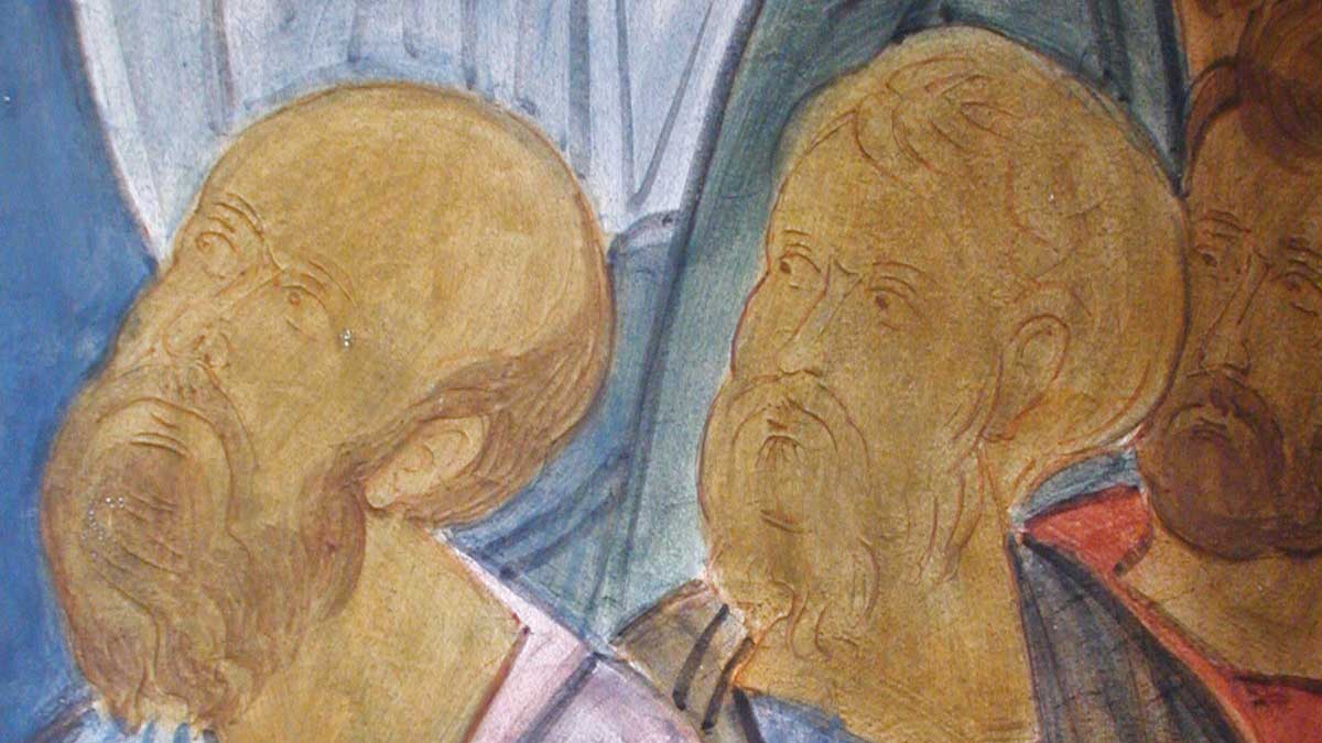
In the complex specification of pigments and painting techniques, the reader will find it challenging to grasp the principles of the relationship between the color and tone of the underpainting (sankir) to the tone and color of the light modeling and finished figure. Furthermore, it is essential to note here that in Coptic paintings of the 4th to 7th centuries (Grabar, 1966), the frescoes of Farasa of the 8th century (Michalowski, 1974), the miniatures of the gospel of Ravvuly (Weitzmann, 1977), the frescos of Cappadocia of the 9th and 12th centuries (11), the icons of the Monastery of Saint Catherine at Mount Sinai from 7th through 12th centuries (Weitzmann, 1976), the Georgian icons of the 11th and 12th centuries (12), yes even generally in all early samples of Eastern Christian painting the methods of painting the face and other parts of the nude body enumerated in the treatise of Theophilus, are often considerably simpler (13). As a rule, if we speak only about the painting of faces, the number of processes is reduced to five or six, whereas in Theophilus’ treatise, there are nine.
The entire chapter, “On Sankir,” from the book Symbolism of Christian Art by Adolph Ovchinnikov, is published in the second issue of the Iconofile Journal.
Notes
1. Icon painters usually start with darker shades as a background color, which they maintain at the edges of an area and in the shadow areas. This is called proplasmos in Greek iconography, which is a dark-toned underpainting. In the areas of the face, hands, and exposed parts of the body, the proplasmos is followed by the grapsimata, which defines the facial features and lines of body parts.
2. D. Ravinskiy in Review of Iconography in Russia at the End of the 17th Century, refers to the book of A. Didron, Manuel liconographie Chretienne, Greque et Latine, Paris, 1845, p. 33. This is a spurious French translation of the book The Painters Manual of Dionysius of Fourna that the archaeologist Didron discovered while traveling among the monasteries on Mount Athos in 1839. However, the chapter cited by the author is accurate and found in accepted modern translations.
3. Translator’s note: Chern translates as “ink.” It is believed that chern was used to mean all black pigments in medieval times. Examination of icons reveals that bone black or carbon black was the black pigment predominately used in medieval icon painting.
4. Translator’s note: Cherleni is usually regarded as an earth mineral pigment of cherry-red color. It is red ochre consisting of iron oxide mixed with kaolin, silicates, and other minerals. Of cherleni obtained in Russia, the best was considered to come from Pskov and the Baltic region. Russian icon painters also imported German red ochre, known for its high clay content, which made it softer to work and especially suitable as a foundation for gilding.
5. D. Ravinskiy, op cit, p. 70.
6. The itemized pigments that compose sankir found in P. Simoni are in agreement in these citations: ochre, black, green earth (glauconite), burnt sienna, and so forth. However, after examining sankir through the microscope on hundreds of Byzantine, Georgian and Russian paintings of the 9th through 15th centuries, besides these pigments, it also contained mineral crystalline pigments: cinnabar, orpiment, realgar, lazurite, azurite, and verdigris. Not all is readily visible, but the red, yellow, and dark-blue crystals (dark blue is sometimes replaced by verdigris or simply by bone black or carbon black) are unavoidably present both in sankir and in the purest white specks of light. Hence it follows that ancient treatises on painting indicated the color of the paint but not its composition, and knowledge of the treatises in no way releases the researcher from using the microscope and performing chemical analyses of pigments. But how did this consistent presence of crystalline pigments come to be part of the practice of ancient artists of Eastern Christian painting? When we compare the structural and optical properties of modern pigments under the microscope with that of ancient mineral crystalline pigments, which have not only the bright color of transparent crystals but also a brilliant glassy surface that actively reflects light, then the difference becomes apparent. If, in the first case, the artist is satisfied by the external correlation of colors, i.e., the resemblance with the phenomena found in Nature or decorative combinations, then iconography, the selection of and ratios of pigments are guided by a seemingly mystical understanding of the elements of painting... The visual revelation of the idea of light as one of the essences of God was the primary objective of the Christian artist from the earliest times. Hence the selection of precisely such minerals, whose particles would saturate the painted surface with a constant glow and, when added to other non-crystalline pigments, would relate them into a united objective. For example, even with the color red ochre, the master iconographer often paints not only with red ochre pigment. Still, it adds to this dark yellow ochre, cinnabar, orpiment, and yellow-brown earth (sienna or goethite). Moreover, the cinnabar, he adds, is rather coarsely ground. Unmistakably, the basis of this “technical” principle is to be found in Christ’s own words: “I am the light of the world. Whoever follows me will never walk in darkness, but will have the light of life.” (John 8:12 — NIV). Herein lies the difference between icons and secular painting. Not only does a person see the icon, but first of all, the icon sees the person. “In him was life, and that life was the light of men.” (John 1:4 — NIV). For greater detail, see A. Ovchinnikov, From the Experience of the Restoration of Ancient Icons, Moscow, 1976, p. 192, 216.
7. Translator’s note: The word “probel” means “gaps” or “spacings.” The word has roots in Russian words meaning “gaps” or “thin lines” and “white.” When applied to color, the term probel, as used by Russian iconographers, usually refers to applying three successively brighter paint tones. As a rule, the first tone is obtained by adding a small amount of whiting to the primary pigment of the first roshkrish. The second is through the addition of a still greater amount of whiting. Hence it always is brighter than the first probel. The third tone is brighter than the second and consists almost entirely of whiting. Sometimes probel is done not in the tone of the first roshkrish but using pigments of other hues; this is called dichroism.
8. Prasinus is usually regarded as the pigment green earth, terra verde, or terre verte. It comprises the minerals glauconite, celadonite, or a combination of the two earth minerals. In the first century B.C., Vitruvius (Book 7, chapter 7) mentioned creta viridis (literally green chalk or green clay) and indicated that it is found in many places. Still, the best type is obtained from Smyrna. Traditionally, Vitruvius creta viridis has been understood to refer to green earth. In the first century A.D., Pliny (Book 35, chapter 6, no. 29-31) described Appian green as a derivative of green earth (appianum viride) and indicated that this green color is similar to chrysocolla. One translator conjectured that the name Appian green might be a revision of apiacum or apianum, meaning “parsley.” Merrifield renders such identification plausible: “Green pigments were also prepared from rue, parsley, columbine, and from the black nightshade. The juice of these plants was incorporated with green earth.” In modern times, green earth has continued to be used as a substrate for dyes. In their translation of Theophilus, Hawthorne and Smith (1979, p. 16) retain the word prasinus, stating in a footnote:
Prasinus is usually regarded as green earth, and Dowdell so translates; however, the easy disintegration of the material in water would be a characteristic of a soluble or finely crystalline substance, not an earthy one; hence we have preferred not to translate the word. Prasinus is perhaps related to the leek-green gem prasitis (Theophrastus) or prasius (Pliny). Translator’s note: The quality of prasinus described by Theophilus that allows it to disintegrate easily may indicate its friable nature. Green earth frequently contains a large amount of silicate and even sand, making it fall apart easily.
9. Byzantine, Eastern Christian, and Russian iconographers almost always used cinnabar instead of minium, to which they added some orpiment.
10. In Byzantine, Eastern Christian, and Russian iconography, black was usually mixed not only with whiting but it is almost always found with cinnabar. Furthermore, pure whiting, mentioned at the end of the chapter, was not at all encountered in its pure form. Even in the most dazzling-white fine lines, there is always present (true, in minute quantity) either cinnabar or orpiment (most frequently together) and a little black or dark blue (either lazurite or azurite).
11. M. Restle, op cit, Vol. 2, Pl. 1, 40, 43, 137, 223, 247, 249, 264, 266, 269, 283, 290; Vol. 3, Pl. 304, 306, 356, 380, 390, 429, 440, 500.
12. For example, the Georgian icon of the 11th–12th centuries, Forty Martyrs of Sebaste (Svanetiya, Museum of the city of Mestiis, Catalog No. 526).
13. This simplification does not indicate a reduction in quality. True religious fervor, characteristic of ancient Christian art, compelled artists to avoid using this “multilayered” technique and to paint more quickly.
References
A. Grabar, Byzantium, London: Thames and Hudson, 1966, Illus. 187, 190, 205.
John G. Hawthorne, Cyril Stanley Smith, translators, On Diver Arts: The Foremost Medieval Treatise on Painting, Glasswork and Metalwork, New York: Dover Publications, 1979, p. 14–19. (Available from Natural Pigments) The author used a text translated into Russian from the ВЦНИЛКР Papers, Moscow, 1963, Vol. 7, p. 66–184. For this article, we used the translation of the famous treatise by Hawthorne and Smith.
Paul Hetherington, translator, The Painters Manual of Dionysius of Fourna, Torrance, California: Oakwood Publications, 1998, p. 14.
K. Michalowski, Faras, Warsaw, 1974.
P. Narodovskiy, “Boris and Gleb” from the volumes of N. Likhachev, Russian Icon, Saint Petersburg, 1914, Vol. 1, p. 78.
D. Ravinskiy, Review of Iconography in Russia at the End of the 17th Century, Saint Petersburg, 1903, p. 70, 91.
M. Restle, Byzantine Wall Painting in Asia Minor, Rechklingbausen, 1967, Vol. 1, p. 205, was used in the Russian text by the author to quote the words of Dionysius. For the English translation of this chapter, we used Paul Hetherington’s translation of The Painters Manual of Dionysius of Fourna.
P. Simoni, The History of the Practices of the Scribe, Bookbinder and Icon Painter in the Book and Icon Workshop, Moscow, 1906, p. 231.
K. Weitzmann, Late Antique, and Early Christian Book Illumination, New York: George Braziller, 1977, Illus. 35–38.
K. Weitzmann, “The Monastery of Saint Catherine at Mount Sinai: The Illuminated Greek Manuscripts,” Vol. 1: The Icons: From the Sixth to the Tenth Century, Princeton, New Jersey: Princeton University Press, 1976, Illus. B-15, B16, B-24, B-32, B-33, B-42, B-45, B-55.
During the Tour of Russian Icons, the editors of Iconofile and other tour group members visited the Grabar All-Russia Art Scientific Restoration Center workshop, where we met Adolph N. Ovchinnikov, director of ancient Russian painting. There he introduced us to his book, Symbolism of Christian Art, containing an extensive review of the symbolism found in Christian art based on his 50 years of experience restoring and researching sacred art. Available only in the Russian language, Iconofile obtained permission to translate portions of his book into English. The entire chapter, “On Sankir,” is published in the second issue of the Iconofile Journal.

Symbolism of Christian Art by Adolph Ovchinnikov