The technique followed by painters in medieval Western Europe to prepare and paint tempera panels and that used by painters in Russia of the same period are closely allied. However, there are some differences in the process, from the preparation of the panel to the final varnish. These differences are interesting to note and can provide insight into the technique and process used by the earliest Byzantine artists to make panel paintings.
In this article, we will review the process of panel painting using texts representative of those techniques, namely Cennino d'Andrea Cennini's Il Libro dell Arte and Hermeneia by Dionysius of Fourna,[1] used by Italian and Russian artists, respectively. For each step of the process, I will first describe the technique used in Russia and then highlight the differences with the technique described by Cennini, representative of artists in Italy and similar to other parts of Western Europe.
Preparation of the Ground
Tempera requires a ground that is non-absorbent and brilliant white in color. Russian iconographers used a recipe for the ground called levkas (левкас). Icon panels were made from dried wood boards, typically linden or alder wood, onto which a cross-hatch pattern was incised with a sharp tool and a size made of animal skin or sturgeon fish was applied. Over this, a layer of linen cloth soaked in the size was laid down, known as pavoloka (паволока).
The composition of the levkas was usually gypsum, chalk, or a combination of the two minerals mixed with animal skin glue diluted with water. To this mixture was frequently added a small amount of honey. The mixture was thick so that the mixing blade could stand vertically. This was applied to the sized panel, and the excess was scraped away to leave a smooth surface. As many as five to ten layers of the levkas were applied. After thoroughly drying the ground, it was moistened with water and polished with a pumice stone.
Section six of Cennini's treatise describes a nearly identical process in chapters 113 through 122. His text, however, offers a more detailed description of the gesso used to make levkas or ground, perhaps due to variations in material technology in Russia. Cennini distinguishes between a gesso grosso and gesso sottile, which is not distinguished in the painting manuals and physical evidence found in Russian icon panels.
Drawing the Figure on the Ground
In Russian icon paintings, it is observed that part of the technique included the execution of the figure on the levkas with the aid of incised lines, called grafia (графья), which were drawn on the levkas with the point of a needle. This grafia facilitated the painter since its outline could not be lost in the underpainting. Cennini also describes this same technique in chapter 123.
The practice of using drawings copied from other work for the basis of the grafia drawn on an icon panel was known in Russia since the 11th century. It is not apparent whether this same practice existed in Western Europe, but Cennini does write in chapter 27 how one should copy the work of a master.
How You Should Endeavor to Copy and Draw After as Few Masters as Possible
Now you must forge ahead again so that you may pursue the course of this theory. You have made your tinted papers; the next thing is to draw. You should adopt this method. Having first practiced drawing for a while, as I have taught you above, that is, on a little panel, take pains and pleasure in constantly copying the best things you can find done by the hand of great masters. And if you are in a place where many good masters have been, so much the better for you. But I give you this advice: take care to select the best one every time, and the one who has the greatest reputation. And, as you go on from day to day, it will be against nature if you do not get some grasp of his style and of his spirit. For if you undertake to copy after one master today and after another one tomorrow, you will not acquire the style of either one or the other, and you will inevitably, through enthusiasm, become capricious, because each style will be distracting your mind. You will try to work in this man's way today, and in the others tomorrow, and so you will not get either of them right. If you follow the course of one man through constant practice, your intelligence would have to be crude indeed for you not to get some nourishment from it. Then you will find, if nature has granted you any imagination at all, that you will eventually acquire a style individual to yourself, and it cannot help being good; because your hand and your mind, being always accustomed to gather flowers, would ill know how to pluck thorns.
The purpose of using patterns in Russia was not to copy the style of a particular master but to adhere to a formula of icon composition. Icon prorisi (прописи) and perevody (переводы) — imprints and transfers — which could also be translated as reverse and direct patterns, respectively — are drawings on paper that meticulously reproduce the outlines of icon compositions.[2] Prorisi and perevody were an additional source for creating strictly canonical images for many a generation of Russian icon painters.
Preparation of Egg Tempera
To prepare the tempera paint, dry pigment is mixed with water and egg yolk. The problem of preserving the colors during the painting process was handled with different methods. Egg tempera has a propensity to putrefy rapidly, especially in warmer climates. Although egg yolk is a perfect emulsion, its natural emulsifying property tends to break down when mixed with pigment and water. The Italians added the sap of fig trees into the egg yolk paint binder, as recommended by Cennini. In Germany, flat beer was sometimes added to preserve the paint. Russian icon painters added kvass to the yolk. Kvass was added in an amount equal to the egg yolk and in place of adding water. Sometimes a little vinegar was added to the binder, or gum tragacanth was mixed with the egg yolk.
Painting Technique
Tempera painting requires the application of thin layers of paint. Light and dark tones of different thicknesses are brought consecutively on top of the other, layer after layer. In the technique used by Russian painters, clothing, draperies, faces, and other fleshly parts of the human body were modeled according to a strict scheme. An underpainting of local color was laid down first. Then a series of shades, each successively brighter than the local color, was applied to achieve highlights.
The primary method of painting flesh involved placing equal quantities of a given pigment in three bowls and mixing each with greater quantities of white. For example, three grades of progressively lighter values of unsaturated pigment are laid side-by-side over green earth or ochre underpainting, leaving the underpainting to show through in the darkest sections and blending the boundaries between the areas like a puff of smoke.[3] The most prominent parts of the form are selectively emphasized using an even lighter mixture. Pure white is reserved for the strongest highlights, and black is used to outline forms and the deepest shadows. Artists used this system in medieval Russia to describe the effects of light and shade within a painting. (See Figure 1) The most saturated or intense colors will be visible in the shaded areas of the form. The tonal modeling of forms is intrinsically tied to the tonal values of the different local colors within a painting so that the shadow of a red garment, for example, will be an intense, saturated red.
Cennini describes the process for painting clothing, buildings, mountains, and the faces of human figures in chapter 140 of his exposition:
How to Paint Faces
When you have done the draperies, trees, buildings, and mountains and got them painted, you must come to painting the faces; and those you should begin in this way. Take a little terre-verte and a little white lead, well tempered, and lay two coats all over the face, the hands, the feet, and the nudes. But for faces of young people with cool flesh color, this couch should be tempered, the couch, and the flesh colors too, with the yolk of a town hens egg, because those are whiter yolks than the one which country or farm hens produce; those are good, because of their redness, for tempering flesh colors for aged and swarthy persons. And whereas on a wall you make your pinks with cinabrese, bear in mind that on the panel, they should be made with vermilion. And when putting on the first pinks, do not have it straight vermilion—have a little white lead in it. And also, put a little white lead in the verdaccio with which you shade at first. Just exactly as you work and paint on a wall, in just the same method, make three values of flesh color, each lighter than the other, laying each flesh color in its place on the areas of the face; still do not work up so close to the verdaccio shadows as to cover them entirely; but work them out with the darkest flesh color, fusing and softening them like a puff of smoke. And bear in mind that the panel needs to be laid in more times than a wall, but still not so much as not to need to have the green, which lies under the flesh colors, always show through a little. When you have your flesh colors down so that the face is about right, make a flesh color a little bit lighter, and pick out the forms[4] of the face, making it gradually lighter, in a careful way, until you finally come to touch in with pure white lead any little relief more pronounced than the rest, such as there would be over the eyebrow, or on the tip of the nose, etc. Then outline the upper edge of the eyes with an outline of black, with a few lashes as the eye requires, and the nostrils of the nose. Then take a little dark sinoper and a trace of black, and outline all the accents of nose, eyes, brows, the hair, hands, feet, and everything in general, as I showed you for a wall; always using that yolk-of-egg-tempera.
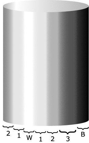
Fig. 1. Method of modeling light used by medieval artists and described in Ceninno Ceninni's Il Libro dellArte.
3, 2, 1 are progressively lighter values made by adding white to the local color; W—White for highlight, B—Black for deepest shadow; The underpainting (veradaccio in Italian painting and sankir in Russian) would be visible in the border area between 3 and B.
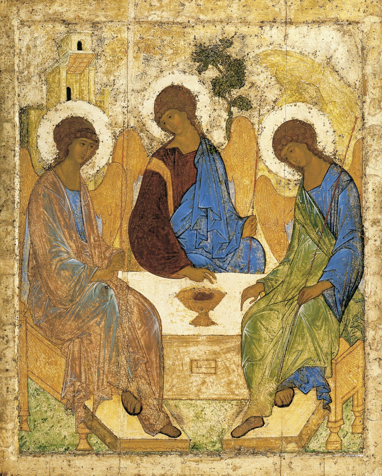
In many respects, Russian iconographers' painting technique resembles the description of 15th-century Italian painting given by Cennini. Clothing, buildings, and background were generally painted before work was carried out on faces, hands, and other exposed parts of the human body. The former elements of an icon were given the common Russian name of dolichnogo (доличного), which means "things painted before the face."
The use of three values— one being brighter than another—for flesh was practiced by Russian iconographers. It is fascinating that the optical effect of ancient Russian icon paintings was derived mainly from the same principles used by painters of Cennini's time. It should be noted that the white ground of icon paintings played an important role in the visual effect of the painted faces and fleshly parts. The white ground reflected light falling on its surface back up through the layers of paint, which, as Cennini tells us, must always be somewhat translucent.
The Pigments Used
Russian icon painters typically favored warmer colors for the underpainting of flesh. In the first few centuries after Russia's conversion to Christianity, these artists used green earth, as typical for Greek Byzantine paintings. But later, they deviated from this practice and began using a mixture of gold or brown ochre with a little black to achieve the underpainting that can be seen in the works of the Novgorodian and Moscow schools. The underpainting is called sankir (санкирь) in Russian, which Cennini identifies as verdaccio. The mixed color, verdaccio, is not a definite quantity but merely a dark, greenish, or brownish tone for outlining and shading.
Cennini described reinstating the outlines of facial features with a mixture of sinoper and a little black. The natural color known as sinoper, or sinopia, is red; this color is lean and dry. The meaning of sinopia is too general to reduce to any single modern-day equivalent. Thompson notes in his translation, "The word sinoper is not in common use by painters now, but I have pressed it into service, because like its cognate sinopia, though a generic term, it may be used in a specific sense. To translate sinopia, Venetian red, would be to fix arbitrarily upon one of many excellent earth reds, all of which Cennini would have unhesitatingly have called sinopia; and that to no good purpose, for there are as many shades of Venetian red in modern trade as there are colormen who sell that universal pigment." Russian painters used similar colors, usually a combination of vermilion or hematite with a little black. The effect would be practically the same.
Cinnabar or vermilion was the primary red used in Russian icon paintings. It was mainly used in flesh colors and clothing and draperies. Cennini also recommends its use in painting faces mixed with a little lead white.
Varnishing Tempera Paintings
In the eyes of Italian painters in Cenninis time and Russian medieval artists, a high value was placed on the varnish that covered the final work. The final varnish gave a deeper tone to the egg tempera painting and helped to even out the surface appearance of the painting.
Easel paintings in tempera were done so that its full effect in the sense of coloring would be obtained after covering by the varnish, under which it changed considerably, giving it a deeper tone and acquiring a yellowish nuance. In medieval Russia, drying oil was used as the final picture varnish known as olipha (олифа). Before coating the tempera painting with drying oil, they frequently gave it a preliminary coating of sturgeon fish glue or egg white (glair). This method prevented the non-uniform distribution of drying oil over the tempera, the formation of spots, and excessive darkening of the colors from the drying oil.
Cennini does not say what the varnish in his day consisted of, but evidence shows that drying oils, gums, and egg white was employed as varnishes by artists in Western Europe.[5] Archaeological evidence indicates that in addition to drying oils, ancient Russian artists added resins to their olipha. Pots of amber and recipes for heating the amber with linseed oil were found in workshops excavated near Novgorod. To the olipha was also sometimes added a small quantity of lead white, called ozhivkami (оживками), literally meaning "to enliven or brighten" the final brush strokes. The effect decreased the varnish drying time and lighten the painting overall.
Conclusion
The similarity in painting technique clearly shows a common source in Byzantine art, which preceded the medieval period in Western Europe and Russia. Russian medieval art sprung directly from Byzantine practice, and the same techniques likely arrived in Western Europe through Byzantine outposts in Italy. The differences are mainly in the availability of local materials that would naturally influence the process of tempera painting.
Notes
1. Although Dionysius of Fourna was an icon painter from Greece born after the medieval period, the author believes his text represents the technique used in medieval Russia after comparing it to podlinik (Russian painting manuals), other written sources, and physical evidence in Russia.
2. For a detailed description of making icon patterns, see the book Russian Icon Designs.
3. See Daniel V. Thomspon, Jr., translator, Cennino d'Andrea Cennini, The Craftsman's Handbook "Il Libro dell Arte" (New Haven, Connecticut: Yale University Press, 1933) republished New York: Dover Publications, 1960, p. 93.
4. I dossi, Literally, "the blacks." Thompson notes in his translation of Cennini, "It is very tempting to interpret i dossi as 'reflected lights,' as Lady Herringham occasionally does but that would imply a degree of sophistication in the treatment of light and shade which Cennino probably did not posses."
5. See Daniel V. Thompson, Jr., The Materials and Techniques of Medieval Painting (New York: Dover Publications) 1956, p. 55–56.
References
Paul Hetherington, translator, The Painters Manual of Dionysius of Fourna (Torrance, California: Oakwood Publications) 1974, p. 6–10.
Martin Kemp, The Science of Art (New Haven, Connecticut: Yale University Press) 1990, p. 265.
Gleb B. Markelov, editor, Russian Icon Designs (St. Petersburg: Ivan Limbakh) 2001, p. 1–13.
Daniel V. Thompson, Jr., translator, Cennino d'Andrea Cennini, The Craftsman's Handbook "Il Libro dell Arte" (New Haven, Connecticut: Yale University Press, 1933) republished New York: Dover Publications, 1960, p. 92–93. (Available from Natural Pigments)
Daniel V. Thompson, Jr., The Materials and Techniques of Medieval Painting (New York: Dover Publications) 1956, p. 55–56. (Available from Natural Pigments)