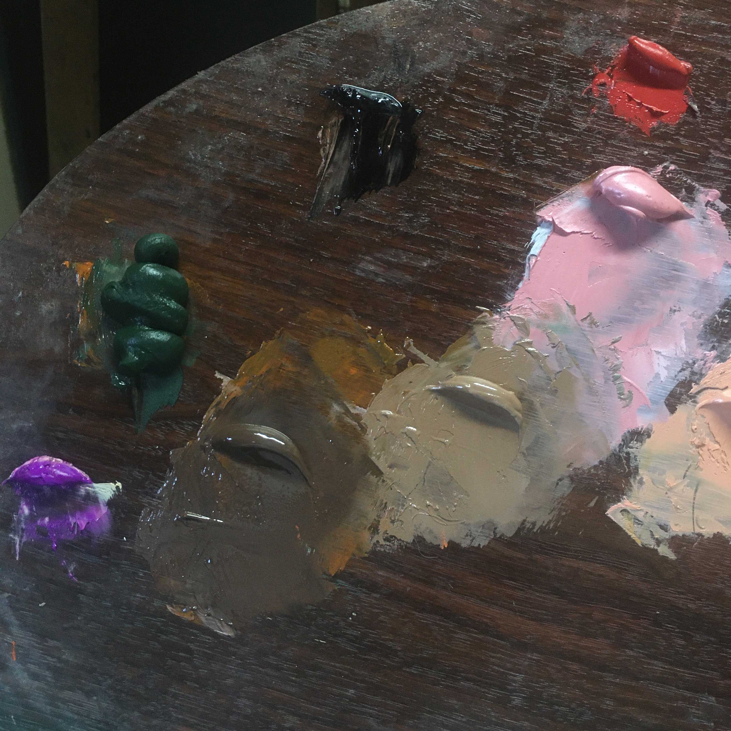
Flesh Tone Color Palette
Lead White (or Titanium White)
Blue Ridge Yellow Ocher
Minium (or Cadmium Orange)
Vermillion (or Cadmium Red Light)
Bone Black
Verona Green Earth
I put great thought into the specific pigments I use on my palette. As I am a figurative artist, I am primarily concerned with developing a versatile, reliable palette, so I do put some thought into the specific pigments I use on my palette. I am talking about pigment interactions. Also, I have been paying close attention to the drying time of oil paints.
As an alla prima painter, I aim to model form, from start to finish, in one continuous process. This is very challenging, and sometimes the fast drying time of oil paints adds extra pressure.
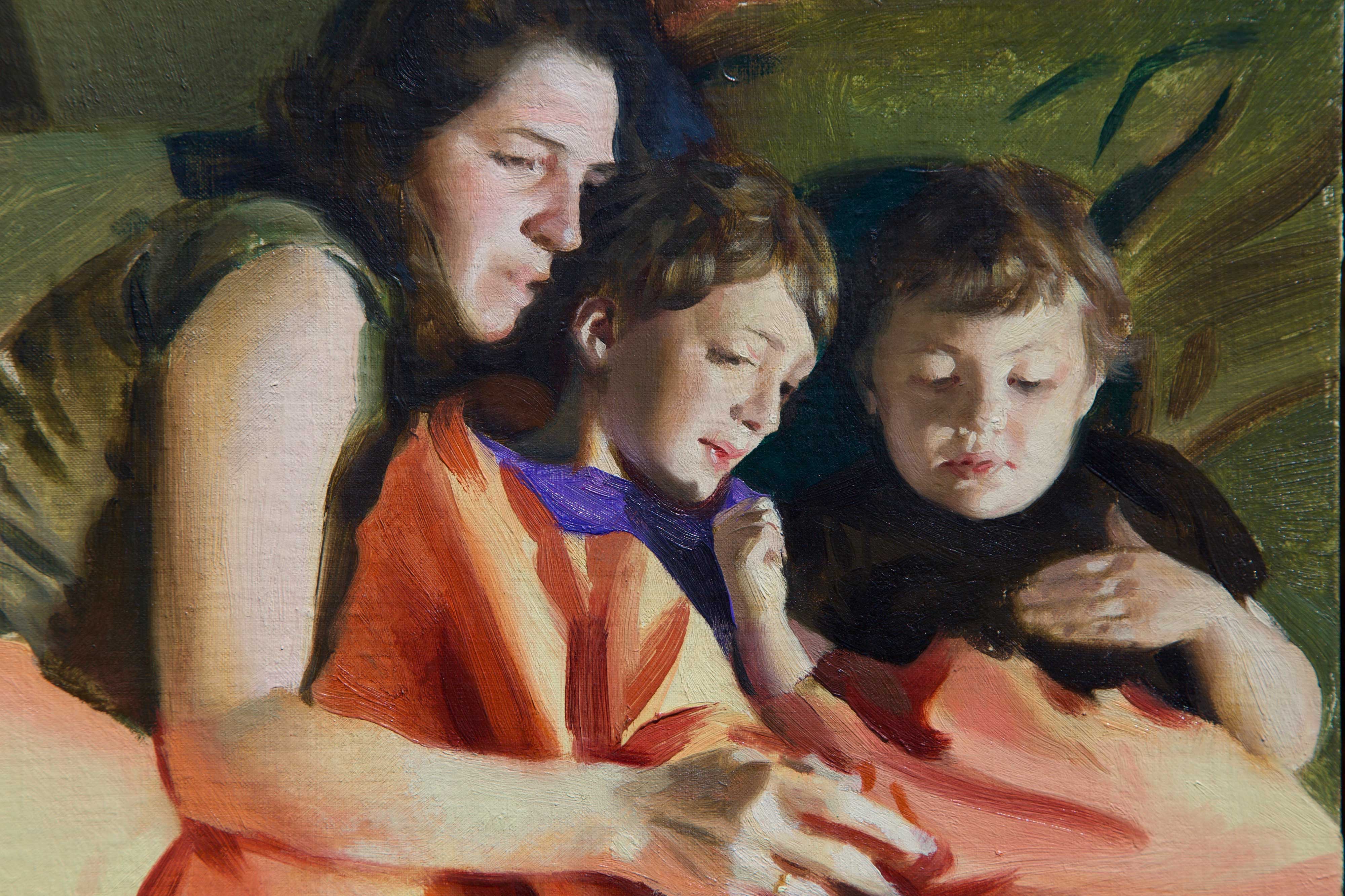
Lately, I have been exploring a modified ‘Zorn palette’ famous for its economy. In addition to Lead White, Yellow Ocher, Vermillion, and Bone Black, I have added the bright, ‘tail light orange’ Minium Red and the deep and forested Verona Green Earth. The latter is the key. I use these two colors together to create a range of flesh tones that oscillate on the edge of either hue.
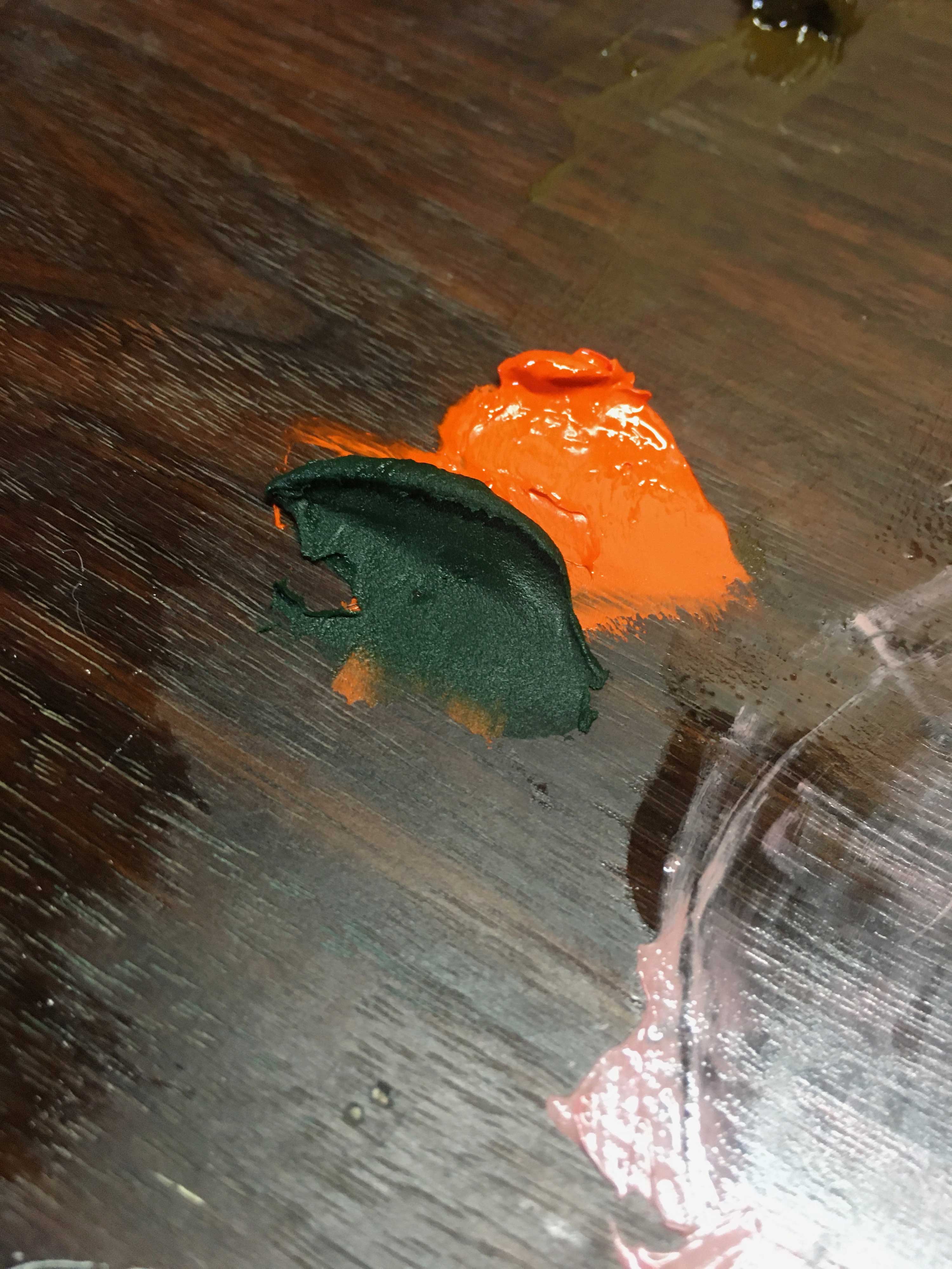
Minium is a powerful pigment, somewhat opaque, while Verona Green Earth has a lower tinting strength and is fairly transparent.
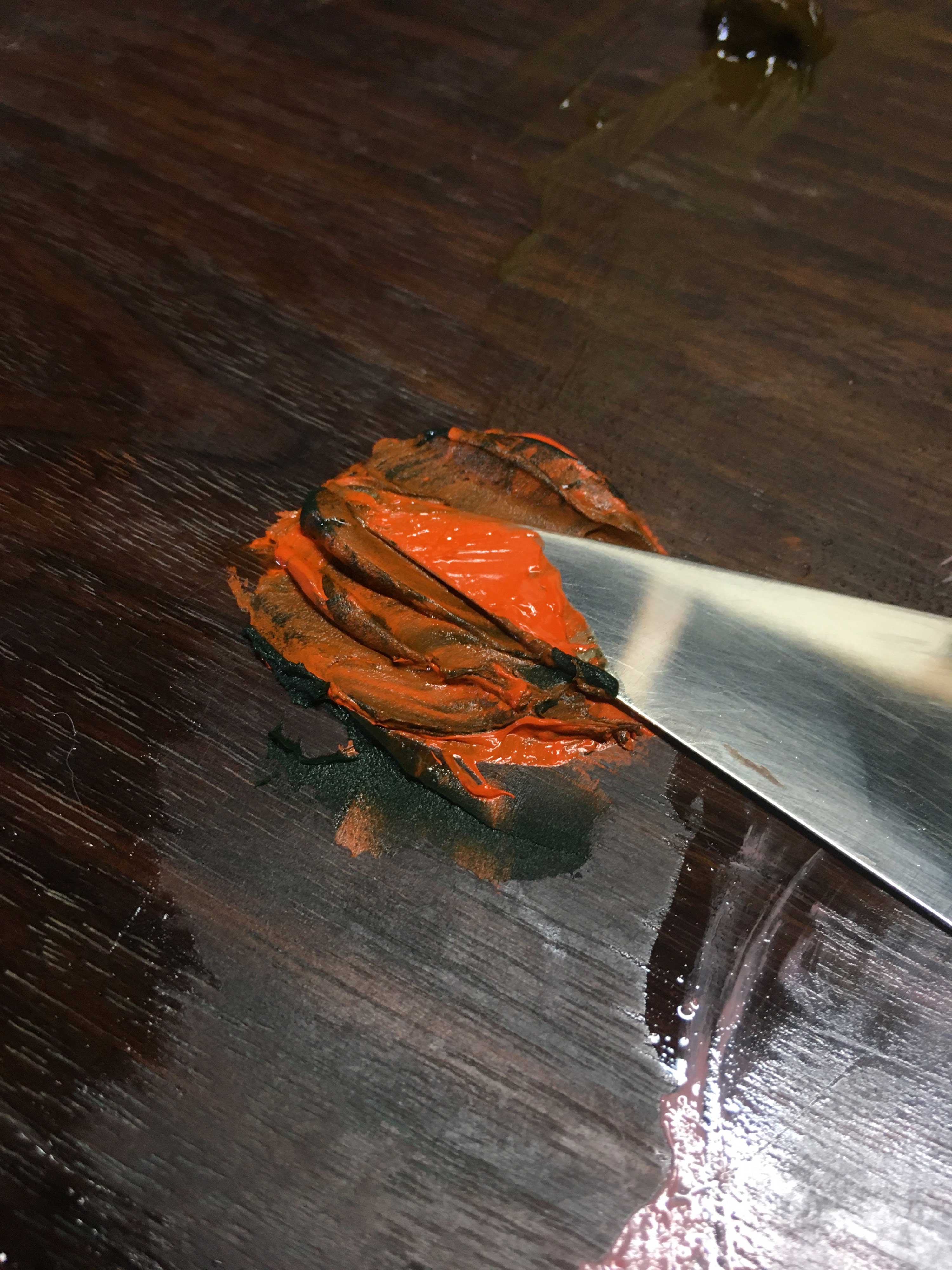
I mix them together in different proportions.
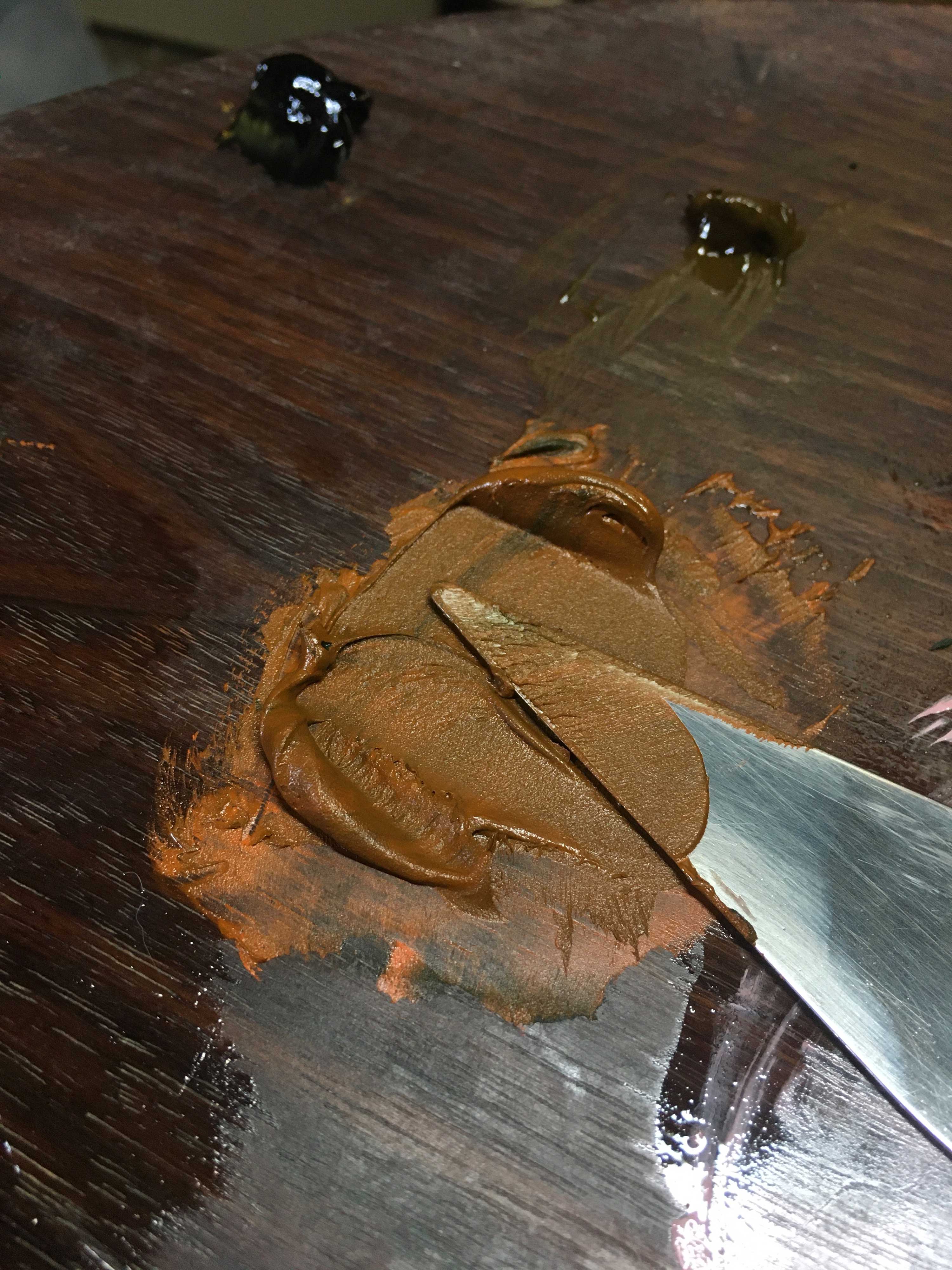
When the two meet, we have a rich, warm color with much more character than the standard umber or brown pigment. I use this mixture to modify my other tints.
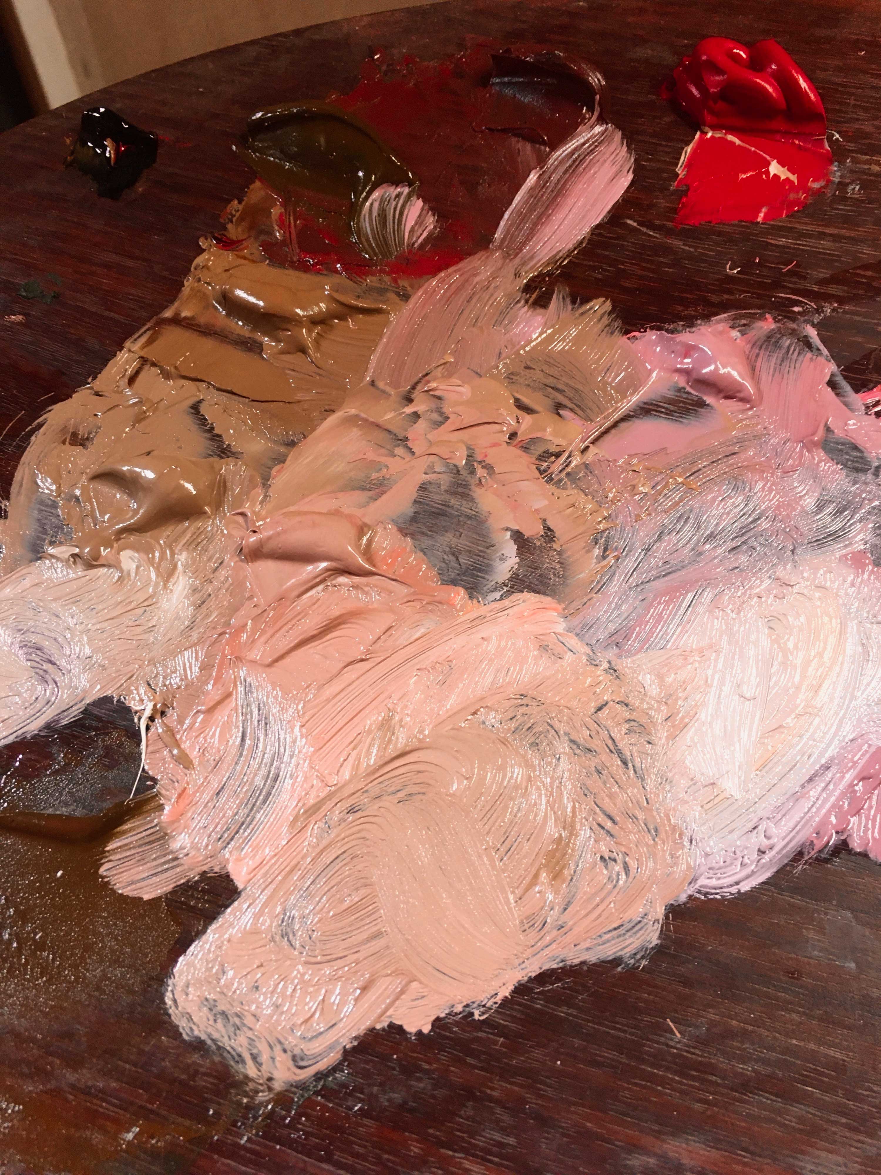
In tints with Lead White, these two cool to chromatic yet neutral skin tones, which are very useful in transitioning across terminators. Green earth can also be used to modify Vermillion for cooler complexions.

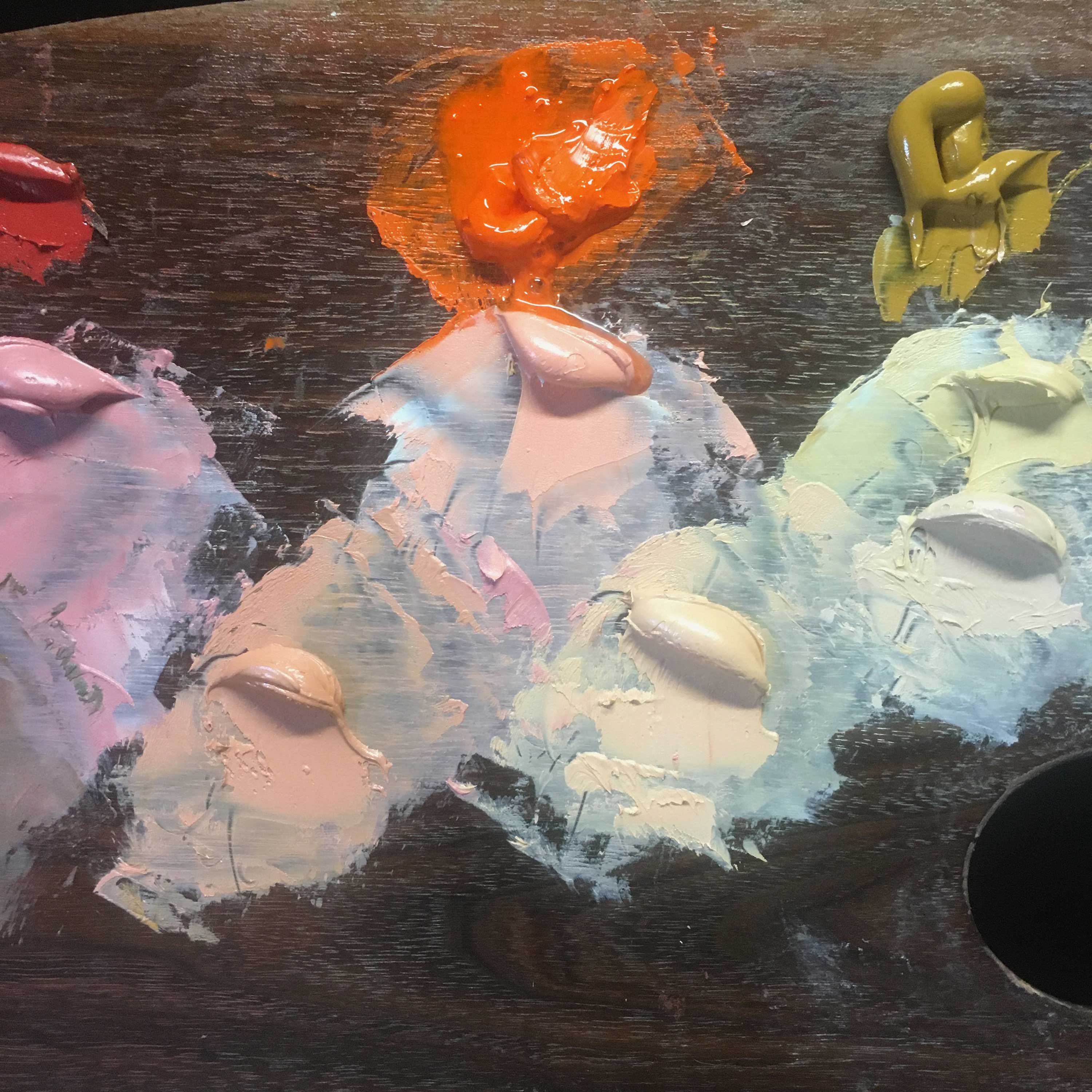
For those that wish to eliminate lead from their palettes, Verona Green Earth behaves the same way with Cadmium Orange and Red in tints of Titanium White. However, the white pigment is many levels of magnitude more powerful. To compensate, I cut the Titanium White 1:3 with Impasto Medium to reduce the tinting strength and increase the transparency. The effect is more or less the same.

I also add Cobalt Violet Pale for the same reasons. This color is a gorgeous bright pink-violet hue with low tinting strength, very fugitive in mixtures. However, I have found that this pigment can be mixed with its yellow complement and retain its high chroma in these mixtures. The violet color ‘sweetens’ the yellow ocher and other pale yellows like Lead-Tin Yellow and Naples Yellow.
These beautiful hues give incredible vibrancy to the panoply of skin tones, which are so wonderfully varied in their own right yet are often painted with dull, monotonous brown tones in classical paintings. Sometimes one can find a range of unexpected hues in a single sitter! Let your palette breathe life into the blood of your subjects in all of their splendor.