The New Zorn Limited Palette
The Zorn palette refers to a palette of colors attributed to the Swedish artist, Anders Zorn (18 February 1860–22 August 1920). It consists of four colors: yellow ocher, ivory black, vermilion and lead white. In this set, we have substituted cadmium red light for vermilion to make this palette more affordable for artists. Read more about the Zorn palette. Buy this palette and save 10%
The Zorn palette is essential for portrait painting. Any skin can be obtained with four colors in the Zorn palette. The oil colors in this package are Lead White, Blue Ridge Yellow Ocher, Cadmium Red Light, and Bone Black.
Using a limited palette like Zorn’s offers several advantages beyond its historical significance. By restricting the number of pigments, artists achieve remarkable cohesion and unity in their work. This simplicity prevents the clashing of colors, ensuring that the composition remains harmonious and balanced.
Moreover, a limited palette enhances focus and attention. With fewer colors to distract the eye, the viewer is naturally drawn to the areas of interest the artist intends to highlight. This means you can precisely guide the viewer’s gaze, making your artwork’s central themes more pronounced and impactful.
Another benefit is simplified decision-making. With only four colors, the process becomes less about endless choices and more about creativity within constraints. This limitation allows artists to masterfully mix hues, creating a broad spectrum of tones that share common elements, thus maintaining visual harmony.
Each color in the Zorn palette plays a specific role, contributing to the overall balance of the piece. For instance, Bone Black adds gravity and depth, while Cad. Red Light offers intensity. These roles are crucial for creating a composition that is both dynamic and pleasing to the eye.
Ultimately, the Zorn palette not only pays homage to the techniques of Renaissance masters but also empowers modern artists with a versatile and focused toolkit, making it an invaluable asset in portrait painting.
Why the Name “Zorn Palette”?
The Zorn palette is a palette of colors attributed to the Swedish artist Anders Zorn (18 February 1860–22 August 1920). It consists of four colors: yellow ochre, ivory black, vermilion, and lead white. In this set, we have substituted cadmium red light for vermilion to make the palette more affordable for artists.
This limited palette is not just a random selection but a testament to Zorn’s artistic philosophy and skill. Although Zorn frequently used additional colors, he is famously associated with this four-color palette. The association may stem from his artistic promotion, as seen in his self-portraits, where the palette is prominently featured.
While many of his contemporaries embraced the vibrant new pigments and techniques that defined Impressionism, Zorn took a different path. Trained in achieving luminous effects, he was known for his mastery of watercolor before turning to oils in 1887. Despite access to modern pigments, Zorn maintained a connection to the past, utilizing a palette reminiscent of ancient Greek art.
A Unique Artistic Vision
Zorn’s decision to limit his color palette was not merely a technical choice but a philosophical one. His travels through Europe brought him into contact with various artists, including American painter Edward Simmons. Simmons encouraged Zorn to explore oils using a simpler palette. Starting with ochre, white, and black, Zorn later incorporated red as his dominant color. This approach allowed him to focus on the subtleties of light and shadow, capturing the essence of his subjects without distraction.
Embracing Simplicity
In an era where artists were increasingly captivated by the possibilities of new pigments, Zorn’s restraint set him apart. His palette choice reflected a deep appreciation for the fundamental elements of painting. By stripping down to the essentials, he honed his skills and achieved rich, complex tones conveying the human experience’s depth and warmth.
Zorn’s work demonstrates how a limited palette can produce a wide range of hues and effects, proving that simplicity can be as powerful as complexity in art. Through his unique vision, Zorn left a lasting impact on the art world, showcasing the beauty and potential of a few well-chosen colors.
The Artistic Significance
In his self-portraits, Zorn appears with palette in hand, presenting it almost as a co-star alongside himself. This deliberate display suggests that Zorn saw these pigments as instrumental to his work as if they were key collaborators in his creative process.
The careful positioning of the palette within these compositions and the dynamic interplay of light and shadow draw attention to its significance. Zorn seemed to be making a statement about the power of simplicity in art, emphasizing skill and creativity over an extensive range of colors.
Legacy and Interpretation
Zorn’s use of this palette could be seen as a message to fellow artists and observers, advocating for the elegance of a limited color range. His portrayal with the palette conveys a sense of mastery and confidence, underscoring the idea that true artistry lies in one’s ability to do more with less.
Therefore, the Zorn palette is not just a set of colors but a symbol of Zorn’s enduring legacy in the art world. Whether he intended it or not, Zorn’s name has become synonymous with this palette, representing a blend of tradition, skill, and innovation.
The Role of Each Color in the Zorn Palette
Each pigment plays a distinct role in this palette, contributing to its effectiveness in rendering naturalistic flesh tones. Ivory Black provides a gentler semi-opaque base than Mars Black, allowing for the creation of subtle greens and purples when mixed with other colors. It helps adjust the value range, offering depth without overpowering the composition.
Yellow Ochre is a mild, earthy yellow that subtly shifts mixtures without dominating them. Its muted warmth aligns closely with natural skin tones, making it ideal for middle values where colors appear most vividly in figurative painting.
Vermilion, or cadmium red light in this more accessible version, introduces a punch of warmth and vitality. It excels in capturing the heat and energy of skin tones, especially in areas where blood flow is prominent, such as cheeks and lips. This pigment can also guide the viewer’s eye through striking accents, balancing larger areas with its strong yet adaptable presence.
Lead White, now often replaced by the less toxic titanium white, is crucial in creating tints and highlights. When combined with black, it forms a cool gray that can mimic the appearance of blue. The warmer pigments harmonize beautifully with lead white to create a balanced color hierarchy.
With its inherently lower chroma, the Zorn palette is meticulously tailored for indoor light conditions. It allows artists to neutralize intense hues to achieve convincing flesh tones with elegance and simplicity.
About Ivory Black in the Zorn Limited Palette
For the genuine colors used by Anders Zorn, see the Original Zorn Limited Palette.
Lists of the black color on the Zorn palette identify it as ivory black, but most ivory blacks sold in the early twentieth century were made from bone char or bone black. Charles Ubele writes about the manufacture of ivory black oil paint on page 124 in Paint Making and Color Grinding:
While many in the trade do not make a distinction between drop black or bone black and ivory black, the latter, nevertheless, is, or at least should be, made from the waste of ivory in turning and cutting of ornaments, etc., but, as there would not be enough to go around for the demand of the trade, the manufacturers of ivory black make use of animal bones, selected especially for this purpose, especially the knuckles and shins of bovines. At the same time, ordinary bone black of extra fine texture and hue is also sold under the name of ivory black.
Charles Ludwig Uebele (1913) Paint Making and Color Grinding: A Practical Treatise for Paint Manufacturers and Factory Managers. Painter’s Magazine.
Read the article The Zorn Palette: Were There Really Only Four Colors?
Color Swatch | Number | Name | Price |
![]() | 303 | Yellow Ochre | 14.90 |
![]() | 542 | Cadmium Red Light | 59.50 |
![]() | 802 | Lead White | 46.80 |
![]() | 903 | Bone Black | 14.90 |
Total | 136.10 |
SKU | 810-1112 |
---|---|
Brand | Rublev Colours |
Vendor | Natural Pigments |
Processing Time | Usually ships the next business day. |
Hazard Pictograms
![]() | ![]() | ![]() |
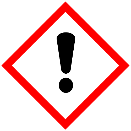
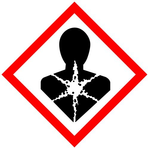
GHS07: Exclamation Mark | GHS08: Health Hazard | GHS09: Environment |
Signal Word: Danger
Hazard Designation
H302 Harmful if swallowed.
H332 Harmful if inhaled.
H360 May damage fertility or the unborn child.
H373 May cause damage to organs through prolonged or repeated exposure.
H410 Very toxic to aquatic life with long lasting effects.
Safety Designation
P260 Do not breathe dust/fume/gas/mist/vapors/spray.
P261 Avoid breathing dust/ fume/ gas/ mist/ vapors/ spray.
P280 Wear protective gloves/ clothing/ eye/ face protection.
P281 Use personal protective equipment as required.
P405 Store locked up.
P501 Dispose of contents/ container according to regional, national and international regulations.
WARNING: This product can expose you to chemicals including lead, which is known to the State of California to cause cancer and birth defects or other reproductive harm. For more information go to www.P65Warnings.ca.gov.